How to Fix Buttons Too Small to Tap on Mobile (October 2026)

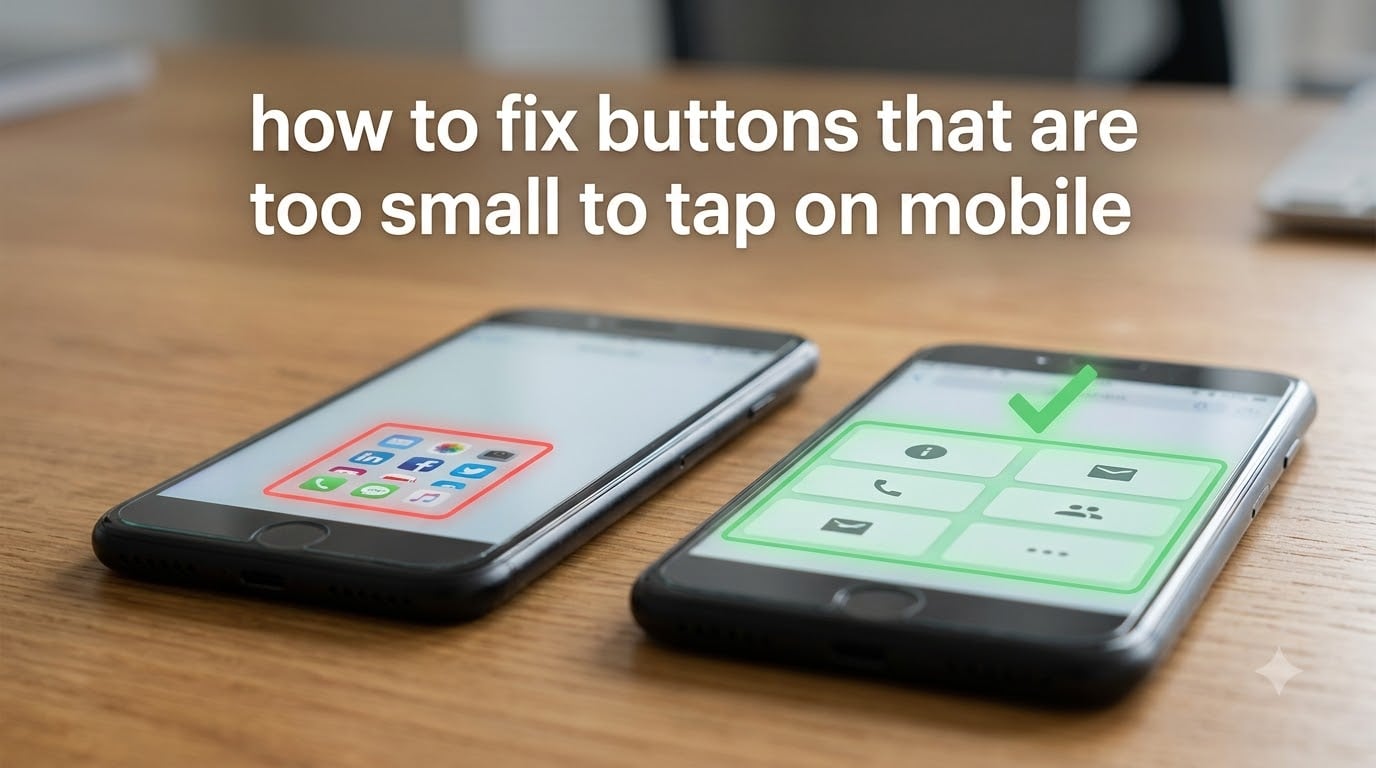
how to fix buttons that are too small to tap on mobile

To fix buttons that are too small to tap on mobile, expand the hit area with at least 44×44 points (iOS) or 48×48 dp (Android) of touchable space, even if the visible icon stays smaller. Add transparent CSS padding around small icons, enable your phone’s built-in display-size and accessibility settings, and check spacing between adjacent … Read more

Make WordPress Site Mobile Friendly Without a Plugin (October 2026)

how to make a wordpress site mobile friendly without a plugin

You can make a WordPress site mobile friendly without a plugin by choosing a responsive theme, setting the viewport meta tag correctly, optimizing images, and adding a few lines of CSS to adjust typography and navigation for smaller screens. Most modern WordPress themes already handle mobile responsiveness, so the real work is fine-tuning your content … Read more

Why Is My Mobile Site Ranking Lower Than Desktop (October 2026)

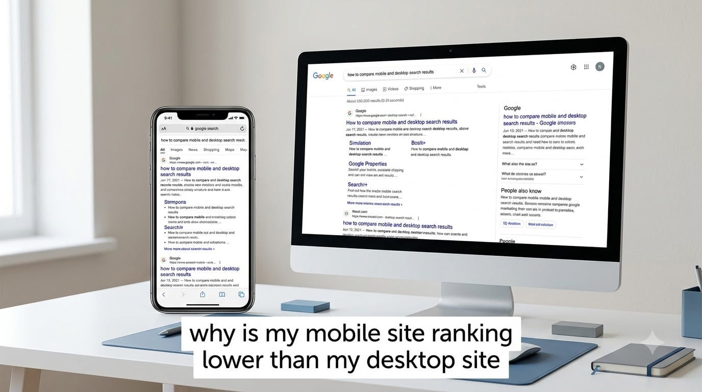
why is my mobile site ranking lower than my desktop site

Your mobile site ranks lower than your desktop site because Google uses device-specific ranking signals, applies different SERP layouts per device, and enforces stricter page speed standards on mobile, even though it indexes your mobile version first. This happens to roughly 83% of websites, not just yours. The 60% of search traffic that comes from … Read more

How to Fix Horizontal Scrolling Mobile Website (October 2026)

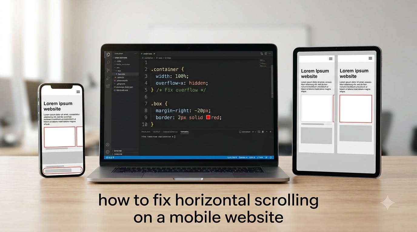
how to fix horizontal scrolling on a mobile website

If you’ve ever opened a site on your phone and watched the page slide sideways, you already know how to spot horizontal scrolling on a mobile website. It’s the annoying swipe-left-and-right behavior that breaks the reading flow, hides menu buttons, and makes a design feel broken even when the desktop version looks perfect. I’ve spent … Read more

Website Look Different Mobile Desktop: Why It Happens (2026)

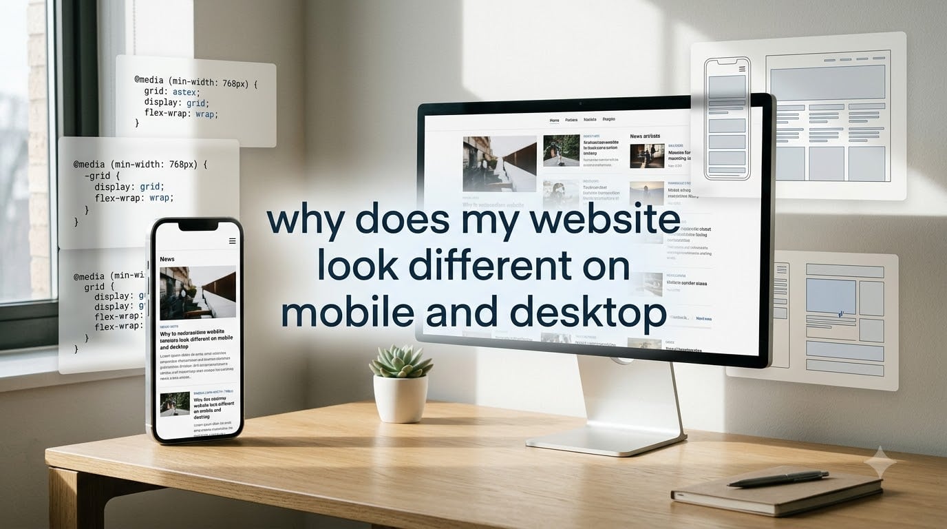
why does my website look different on mobile and desktop

If your website looks perfect on a 27-inch monitor but cramped, blurry, or broken on a phone, you’re not imagining things. The visual differences between mobile and desktop come from how browsers render pages for different screen sizes, and most of the time those changes are intentional. I see this question almost daily in web … Read more