
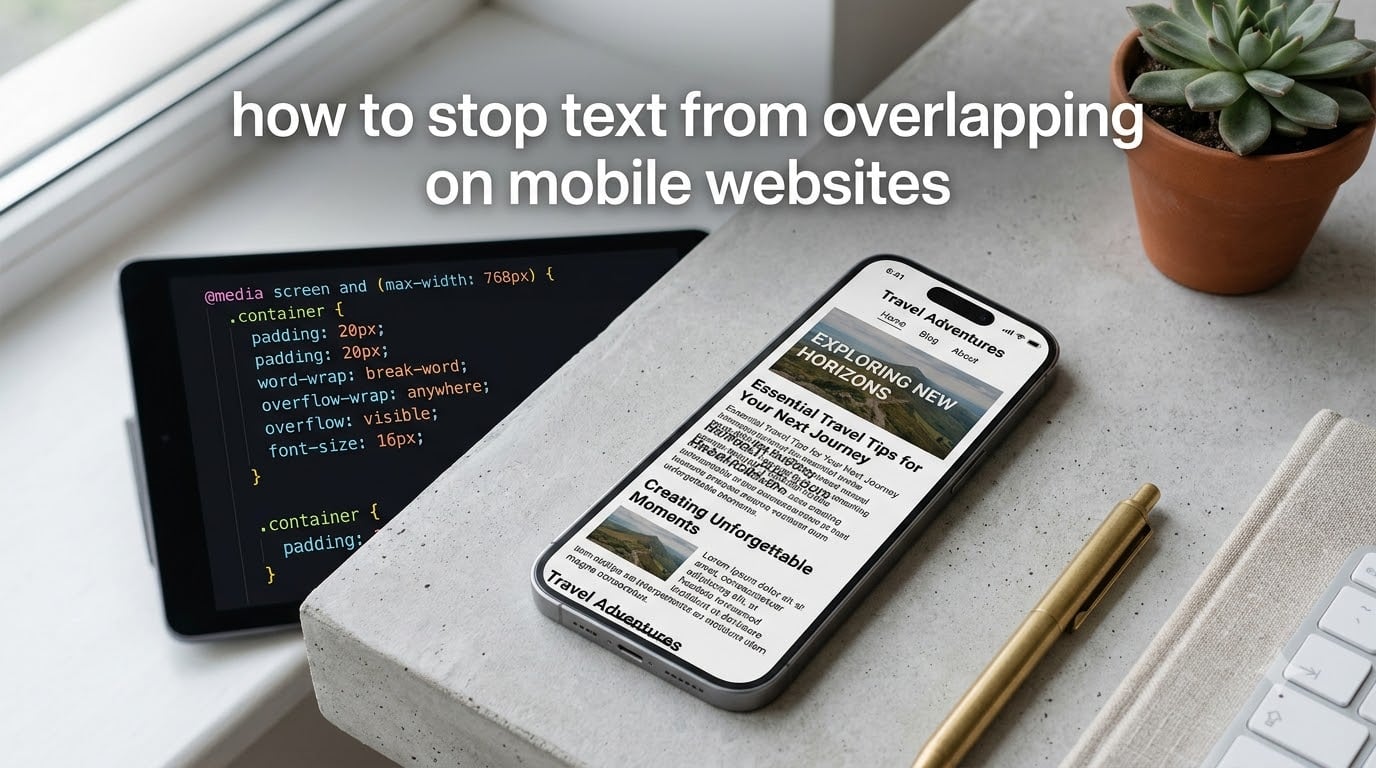
Learning how to stop text from overlapping on mobile websites usually starts the same way: a visitor emails you a screenshot, or you open your site on a phone and watch two headings crash into each other. Everything looks perfect on your desktop monitor, then the moment the screen narrows, your layout falls apart. I have fixed this problem on dozens of client sites, and the good news is that almost every case traces back to the same handful of causes.
In this guide, I will walk you through why text overlaps on phones, the exact CSS fixes you can copy and paste, and the platform-specific steps for WordPress, Wix, Squarespace, and Showit. You will also learn which iOS and Android settings secretly enlarge your text and how to test for overlap before your visitors ever see it.
This matters more than cosmetics. Overlapping text makes pages unreadable, drives visitors away, and can hurt your rankings since Google rewards mobile-friendly pages. Every fix below works in 2026 browser environments and none requires a redesign.
Table of Contents
Why Text Overlaps on Mobile Websites
Text overlaps on mobile because elements lack flexible width, adequate spacing, or responsive CSS rules, so when the screen narrows, content renders on top of neighboring content instead of reflowing. Desktop monitors hide these problems because they give your layout 1200 pixels or more of room to breathe. A phone screen offers 375.
After debugging this issue across many projects, here are the causes I see over and over:
- Fixed-width containers – A div set to 600px cannot shrink on a 375px screen, so its contents spill over neighbors.
- Absolute positioning – Reddit’s r/css community flags this constantly: elements pulled out of the document flow stop responding to screen size and collide with everything around them.
- Long unbreakable strings – URLs, email addresses, and long words have no natural break points, so they overflow their container instead of wrapping.
- white-space: nowrap – This CSS rule forbids wrapping entirely, forcing single-line text to run straight through adjacent elements.
- Missing viewport meta tag – Without it, mobile browsers render your page at desktop width and scale it down, which distorts spacing unpredictably.
- Tight line height or letter spacing – Custom fonts with cramped line height stack lines on top of each other, especially when a device enlarges the font.
- Device font scaling – iOS and Android accessibility settings can inflate text 200 percent beyond what your CSS specified.
One Stack Overflow thread describes the classic symptom perfectly: instead of wrapping, the text “writes over itself” in mobile browsers. That single clue, writing over itself versus spilling into a neighbor, tells you which cause you are dealing with.
How to Stop Text from Overlapping on Mobile Websites
The fastest way to stop text from overlapping on mobile websites is to fix the viewport, let long words break, allow text to wrap, and replace absolute positioning with flexible layout rules. Work through these steps in order, because each one eliminates an entire category of causes.
Step 1: Verify Your Viewport Meta Tag
Check that this line exists inside the <head> of every page:
<meta name="viewport" content="width=device-width, initial-scale=1">
Without it, mobile browsers assume a 980px desktop canvas and zoom out, which makes spacing unpredictable. This one tag fixes overlap on a surprising number of sites by itself.
Step 2: Let Long Words Break
Long URLs and unbreakable strings are the number one cause of text running over itself. Add this to the offending container:
.my-text { overflow-wrap: break-word; word-break: break-word; }
Now a 60-character URL will snap to the next line instead of plowing through your sidebar.
Step 3: Remove white-space: nowrap
Search your stylesheet for white-space: nowrap. Each instance is a command telling text “never wrap,” which is exactly how a headline ends up printed across a button. Either delete it or scope it to desktop only:
@media (min-width: 768px) { .header-tagline { white-space: nowrap; } }
Step 4: Replace Fixed Widths with Max-Width
Swap width: 600px for max-width: 600px; width: 100%;. The container can now shrink on small screens while keeping its intended size on large ones. Also give images max-width: 100%; height: auto; so they never force their container wider than the screen.
Step 5: Kill Absolute Positioning in Responsive Sections
Avoid absolute positioning for content that must reflow. The r/css community consensus is to nest elements inside a normal-flow parent container and use flexbox instead:
.hero { display: flex; flex-direction: column; gap: 1rem; }
Flex children push each other apart naturally, so text collision becomes structurally impossible.
Step 6: Open Up Line Height and Letter Spacing
Custom fonts often need more breathing room than system defaults. A safe baseline:
body { line-height: 1.5; letter-spacing: 0.01em; }
Showit’s own help docs recommend this exact approach: add space between text and its bounding box, reduce font size by 1-2px, then adjust line height and letter spacing.
Step 7: Add a Media Query Safety Net
If one stubborn section still breaks, target it directly on small screens:
@media (max-width: 480px) { .problem-section { font-size: 0.9rem; line-height: 1.6; padding: 1rem; } }
Adjust the values until the section breathes. Media queries are your precision instrument when global rules are not enough.
The Three CSS Properties That Control Text Wrapping
Three CSS properties do most of the heavy lifting against mobile text overlap: overflow-wrap, white-space, and word-break. Understanding how they differ tells you which one your situation needs.
overflow-wrap: break-word breaks a word only when it is too long to fit alone on a line. This is your default choice because it preserves normal wrapping everywhere else.
word-break: break-word is the aggressive sibling, allowing breaks within words whenever needed. Use it for strings that must never overflow, like pasted URLs in comments.
white-space controls whether wrapping happens at all. Normal wrapping is what you want almost everywhere; nowrap should be reserved for short decorative labels on wide screens only.
My simple rule after years of debugging this: break long words, wrap everything else, and never rely on nowrap on a phone.
Platform-Specific Fixes: WordPress, Wix, Squarespace, and Showit
Most platforms cause overlap through their drag-and-drop editors, which let you place text anywhere without anchoring it to neighboring elements. Here is how to fix each one.
WordPress (Including Elementor)
In Elementor, overlap almost always comes from negative margins or absolutely positioned widgets. Open the section, set Position back to Default in the Advanced tab, and remove negative margins on mobile. Add custom CSS under Appearance, Customize, Additional CSS using the snippets above.
Wix
In the Wix Classic Editor, the fix is structure: rebuild overlapping sections using strips and columns instead of free-floating text boxes. Anchor text elements to their container so they scale together. Check the mobile editor view separately, because Wix lets you adjust mobile layout independently of desktop.
Squarespace
Squarespace overlap usually stems from spacers and text blocks stacked in one column. Drag blocks side by side so the fluid engine anchors them, then reduce font size at the mobile breakpoint under Site Styles.
Showit
Showit’s canvas is free-form by design, so it needs bounding-box discipline. Add extra space between text and its bounding box, shrink fonts by 1-2px on the mobile canvas, and adjust line height and letter spacing. Showit keeps separate desktop and mobile canvases, so always fix the mobile canvas directly rather than hoping desktop rules translate.
iOS and Android Settings That Cause Text to Overlap
Sometimes your CSS is fine and the visitor’s device is the culprit. iOS and Android both offer accessibility features that enlarge text beyond your specified sizes, pushing it past container bounds.
On an iPhone, check Settings, Accessibility, Display & Text Size. Larger Text or Bold Text can inflate fonts dramatically, and custom web fonts render larger on iOS than Android even at identical sizes. On Android, Settings, Display, Font size and display size scales text system-wide, and some browsers auto-zoom text fields.
You cannot disable these settings, but you can accommodate them. Use relative units like rem instead of px for font sizes, keep line height generous, and leave padding around text so enlarged text has room to grow. Also confirm your own browser zoom is at 100 percent before testing, because a stray zoom level creates overlap that your visitors will never see.
How to Test for Text Overlap Before Visitors See It
Catching overlap early requires testing at real phone widths, not just shrinking your desktop window. Here is the routine I run before shipping any layout.
First, open Chrome DevTools and toggle device toolbar, then cycle through iPhone SE (375px), a mid-size phone, and tablet widths. The narrowest width exposes the most breakage. Drag the width slider continuously between 320px and 768px and watch for the moment elements collide.
Second, test long content: paste a 60-character URL and a 30-character word into your headings and paragraphs. If the layout survives hostile strings, it will survive normal ones.
Third, check a real iOS device if you can. Safari renders custom fonts differently than Chrome’s emulator, and Android Chrome has its own text auto-sizing behavior. Rotating the device between portrait and landscape also exposes overlap that static widths hide.
Common Mistakes That Make Overlap Worse
Avoid these traps I see repeatedly in forums and client work:
- Setting fixed pixel heights on text containers, which clips or overflows when a device enlarges the font.
- Using nowrap on buttons and tags without a mobile media query override.
- Hiding overflow to mask the symptom, which trades visible overlap for invisible, inaccessible text.
- Testing only in one browser at one zoom level and assuming the result universal.
- Applying absolute positioning to headings or calls to action inside responsive sections.
Frequently Asked Questions
How to stop overlapping text?
Set a proper viewport meta tag, add overflow-wrap: break-word to text containers, remove white-space: nowrap on small screens, replace fixed widths with max-width, and swap absolute positioning for flexbox layouts. Then test at 375px width in browser DevTools.
Why is my text overlapping HTML?
Text overlaps in HTML when elements lack flexible sizing or proper wrapping rules. Common causes include fixed-width containers, absolutely positioned elements, white-space: nowrap, long unbreakable words, and missing viewport meta tags. When the screen narrows, content with no room to reflow renders on top of neighboring elements.
Why does text overlap only on mobile but not desktop?
Desktop screens give layout elements plenty of horizontal room, so sizing mistakes stay hidden. Phones offer roughly 375 pixels of width, so fixed widths, nowrap rules, and absolute positioning that worked at 1200 pixels force text to collide at phone widths.
How do I fix text overlap without affecting desktop view?
Scope your fixes inside a media query such as @media (max-width: 768px), then apply wider line height, smaller font size, and overflow-wrap rules only at small widths. Desktop styles stay untouched while mobile gets the corrections.
How do I stop text overlapping in Word?
This guide covers websites rather than Word documents. In Microsoft Word, overlapping text usually comes from text boxes or fixed line spacing; fix it by selecting the text, setting exact line spacing, and repositioning or resizing the affected text box.
Fix Overlapping Text for Good
Knowing how to stop text from overlapping on mobile websites comes down to a simple sequence: fix the viewport, let long words break, allow wrapping, replace fixed widths, and drop absolute positioning. From there, generous line height, rem-based font sizes, and platform-native layout structure keep the problem from returning.
Your next step is a five-minute audit. Open Chrome DevTools, set the width to 375px, and scroll every page of your site with a long URL pasted into your headings. Anything that collides, fix with the matching step in this guide.
Your mobile visitors, and your rankings, will thank you for it.