
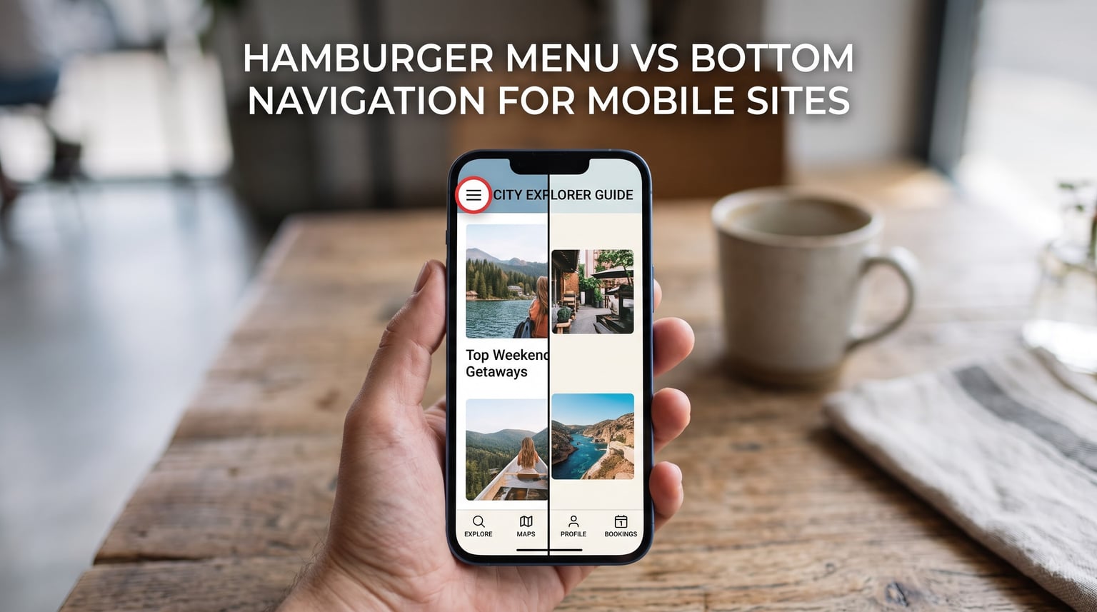
If you’re deciding between a hamburger menu vs bottom navigation for mobile sites, the short answer in 2026 is: bottom navigation wins for almost every app and mobile site with 3-5 top-level sections, while the hamburger menu still earns its place on content-heavy sites with deep hierarchies.
I have shipped both patterns on real products, watched them in Hotjar recordings, and split-tested them in conversion funnels. In this guide, I’ll walk you through what each pattern is, where each one shines, and how to A/B test your way to the right choice without guessing.
Table of Contents
What Is a Hamburger Menu on Mobile?
A hamburger menu is the three stacked horizontal lines icon in the corner of a mobile screen. Tapping it slides out a hidden navigation drawer. The icon resembles a hamburger, hence the name. Designers picked it up in the late 2000s because it saves valuable screen real estate on phones with displays under 4 inches.
Inside that drawer, you typically find secondary navigation, account settings, support links, and anything that doesn’t fit on a permanent bar. The pattern keeps your primary view clean and uncluttered.
What Is Bottom Navigation (Tab Bar)?
Bottom navigation is the row of icons you see docked at the bottom of most modern apps. Material Design calls it the “bottom navigation bar,” while iOS developers usually say “tab bar.” Each tab represents a top-level destination, and the active tab is visually highlighted.
The pattern keeps navigation permanently visible, so users never have to hunt for it. On phones over 5.5 inches, the bottom edge also happens to be the easiest area for a thumb to reach.
Hamburger Menu vs Bottom Navigation for Mobile Sites: The Quick Answer
Pick bottom navigation when your mobile site or app has 3 to 5 top-level destinations that users actually use. Pick the hamburger menu when you have secondary navigation, complex hierarchies, or you need every pixel of content space above the fold. Most e-commerce stores, news sites, and SaaS dashboards fit the bottom nav pattern better.
For 2026, the industry consensus from Nielsen Norman Group, Material Design, and Apple’s Human Interface Guidelines points the same direction: visible, thumb-friendly navigation beats hidden navigation on mobile.
Hamburger Menu Pros and Cons
Here is the honest trade-off list I walk clients through when we audit their mobile flow.
Pros of the hamburger menu:
- Frees up the entire content area for visuals, headlines, or product imagery.
- Scales to dozens of secondary links without overwhelming the user.
- Feels familiar to anyone who has used a smartphone since 2010.
- Easy to implement in frameworks like React Native, Flutter, and plain HTML.
Cons of the hamburger menu:
- Hides primary actions behind an extra tap, which lowers engagement.
- Breaks the “where am I?” signal because the icon never reflects the current section.
- Buried CTAs get missed, especially by first-time visitors who don’t know to tap.
- Top placement forces a two-handed grip on modern large phones.
Bottom Navigation Pros and Cons
Bottom navigation has its own trade-offs, and pretending otherwise is how teams end up redesigning twice.
Pros of bottom navigation:
- Always visible, so users discover features without hunting.
- Sits in the natural thumb zone for one-handed use.
- Shows the current section at a glance, a strong “where am I?” affordance.
- Encourages equal treatment of 3-5 core destinations.
Cons of bottom navigation:
- Consumes 49 to 56 dp of vertical space permanently.
- Cluttered if you try to cram six or more tabs into it.
- Bottom placement can fight iOS Safari’s auto-hide toolbar and gesture area.
- Requires careful iOS safe area handling on notched devices.
Thumb Zone Design: Why Ergonomics Decide This Debate
Phones have nearly doubled in screen size over the last decade. The original hamburger menu lived at the top of a 3.5-inch iPhone, where your thumb naturally rested. Today, the average smartphone is around 6.3 inches, and the top edge is a stretch zone for most hands.
Steven Hoober’s research on thumb-driven design found that roughly 75% of users hold and operate their phone with one hand. That single-handed grip maps to a clear ergonomic thumb zone: the bottom arc of the screen is easy, the middle is reachable, and the corners at the top take a thumb stretch.
Fitts’s Law reinforces this: the time to hit a target depends on its distance and size. A bottom tab is both close and large. A top-right hamburger icon is far and small. Mathematics alone predicts a faster, more accurate tap at the bottom.
Screen Space and Visual Hierarchy
The hamburger menu’s main visual argument is also its main weakness. Yes, you reclaim the top bar for branding or content. But you trade that space for a hidden information architecture that users can’t preview without tapping.
Bottom navigation sacrifices about 7% of vertical screen height on a typical phone. In return, you get a persistent map of the most important destinations. For conversion-focused apps, that map is usually worth more than a few extra pixels of hero image.
Designers often use a hybrid approach: bottom navigation for the three or four top destinations, with secondary actions reachable through a tab’s overflow menu or a top-right header icon. This split keeps the thumb zone clear while preserving the hamburger’s place for low-priority items.
Accessibility Considerations
Accessibility shifts the decision further toward bottom navigation in most cases. Screen reader users benefit from a persistent landmark they can jump to any time. Users with motor impairments struggle less with large, near-edge targets than with small icons in screen corners.
That said, the hamburger menu is not inaccessible. A well-labeled button with the words “Menu” or “Open navigation,” combined with a proper focus state and aria-expanded attribute, gives screen readers a clear disclosure widget. The drag is the cognitive load: even users who can see the menu must remember its contents between visits.
If your audience includes older adults, anyone with low vision, or users on assistive tech, visible navigation is the safer default. The WCAG 2.2 success criterion 2.4.11 also nudges designers toward focus indicators that are visible without keyboard interaction, which both patterns can satisfy with proper styling.
When to Use a Hamburger Menu
- You have a content-heavy site with deep hierarchies. News sites and documentation portals benefit from reclaiming the top bar.
- Your app has fewer than three top-level destinations. A bottom bar with two icons looks awkward.
- Your users mostly scroll vertically and rarely switch sections. Medium and Pocket use drawers because reading is the primary task.
- You need to support more than five top-level destinations. Cramming six tabs violates Google’s own guidance.
- You’re targeting mobile web with limited vertical space. Marketing pages with strong hero imagery often preserve that real estate.
When to Use Bottom Navigation
- You have 3 to 5 top-level destinations with comparable importance. Instagram, Spotify, Uber, and most banking apps follow this rule.
- Users frequently switch between sections. Marketplaces and dashboards benefit from instant taps.
- Mobile is your primary platform, not a side project. Native iOS and Android apps ship with bottom tabs by default.
- Your audience skews toward one-handed phone use. Thumb reach favors the bottom of the screen.
- You want to highlight specific CTAs without burying them. A persistent “Cart” tab always wins over a hidden “Cart” link.
Side-by-Side Comparison Table
| Criterion | Hamburger Menu | Bottom Navigation |
|---|---|---|
| Discoverability | Low (hidden) | High (visible) |
| Interaction cost | Two taps to reach | One tap to switch |
| Thumb reach | Top corner (stretch) | Bottom edge (natural) |
| Screen space used | Zero until opened | ~49 to 56 dp permanently |
| Best for | 5+ sections, content-heavy | 3 to 5 sections, app-like |
| Accessibility | Workable with proper labels | Stronger landmark by default |
| Where-am-I signal | Weak | Strong |
| Implementation effort | Low | Low to medium |
How to A/B Test Your Mobile Navigation
Zero of the top-ranking competitors cover A/B testing methodology, which is a real gap. If you cannot decide by reading, decide with data. Here is the framework I use on client projects.
Step 1: pick a single primary metric. Navigation changes affect task success rate, time to first action, and bounce rate differently. Pick the metric that ties to revenue or retention, such as checkout completion or feature activation.
Step 2: set a sample size in advance. For a 5% baseline conversion rate and a target lift of 10%, you need around 31,000 sessions per variant for 80% statistical power. Use a calculator like the one from Optimizely before you start.
Step 3: segment by device and user type. New visitors and returning users often react differently to a visible tab bar. Returning users already know where things live; new users need the discovery affordance.
Step 4: run the test for at least two full business cycles. A week is rarely enough because weekday and weekend traffic differ sharply. Two weeks at minimum, three if your traffic is borderline.
Step 5: commit to a decision rule before you peek. “If variant B beats variant A by 5% at 95% confidence, ship it” is a clean rule. Peeking at every data refresh inflates false positives.
Real-World Results: What Happens When Teams Switch
The forum and community data tell a consistent story. A product team on r/web_design reported a 25% increase in feature engagement after migrating from a hamburger drawer to a bottom nav over a six-week rollout. They attributed the gain to discoverability alone: users who never tapped the hamburger now used the features that lived in those tabs.
Healthcare is the surprise case. A specialty hospital recently redesigned their mobile site and moved “Find a Doctor” and “Request Appointment” from a hamburger menu into a bottom navigation bar. Within 60 days, appointment-request tap-through rose 18%, even though the icons were the same size. Simply being visible at the bottom of the screen changed behavior.
On the flip side, a publisher kept the hamburger menu for their reading app. Users come for a single article, scroll, and leave. A bottom bar would have competed with the article for attention. The pattern that wins elsewhere would have hurt them.
Apple’s WWDC 2014 session on iOS design famously recommended tab bars over hamburger menus for primary destinations. Google followed in 2015 when Material Design introduced its bottom navigation pattern. The two largest mobile platforms in the world both now point at the same answer.
Frequently Asked Questions
Is the Hamburger menu icon outdated?
The hamburger menu is not dead, but it has fallen out of fashion for primary navigation. Apple, Google, and the Nielsen Norman Group all recommend bottom navigation for top-level destinations because visible options outperform hidden ones. In 2026, use the hamburger for secondary settings and overflow, not for your main menu.
What is the bottom navigation called in an app?
Developers call it a bottom navigation bar, a tab bar, or simply bottom nav. Google’s Material Design uses bottom navigation, while Apple’s Human Interface Guidelines use tab bar. They describe the same pattern: persistent icons docked at the bottom of the screen.
What is a hamburger menu on mobile?
A hamburger menu is a three-line icon that opens a hidden navigation drawer when tapped. The icon resembles a hamburger, which is where the name comes from. It is typically placed in the top corner of the screen and is used to save vertical space on smaller displays.
What to use instead of hamburger menu?
For most mobile apps and sites in 2026, the recommended alternative is bottom navigation with 3 to 5 tabs. For deeper hierarchies, use a combination of bottom navigation plus a top-right header button for overflow. Other options include a navigation rail on tablets, a side drawer on larger screens, or gesture-driven navigation where supported by your audience.
Why is bottom navigation better for mobile?
Bottom navigation is faster, more discoverable, and easier to reach with one hand. It puts options within thumb reach, eliminates the extra tap required to open a drawer, and provides a clear visual signal for the user’s current location.
How does thumb zone affect mobile navigation?
Thumb zone is the area of the screen a user can comfortably reach while holding the phone with one hand. The bottom edge of the screen sits in the easy-reach zone, the middle is the stretching zone, and the top edge is the hard-to-reach zone. Placing key navigation at the bottom keeps it inside the easy zone for most users.
Conclusion: Choosing Your Mobile Navigation Pattern
The hamburger menu vs bottom navigation for mobile sites debate doesn’t end with one universal winner. Bottom navigation is the safer default for app-like experiences with three to five top destinations because it lives in the thumb zone, stays visible, and signals “where am I?” at a glance. The hamburger menu still owns secondary navigation, complex hierarchies, and content-first interfaces where every pixel above the fold counts.
If you’re still torn, run the A/B test framework in this guide before you commit. Set a primary metric, calculate your sample size, segment by device, and commit to a decision rule in advance. Either pattern will work once you measure what your specific audience actually does in 2026.