
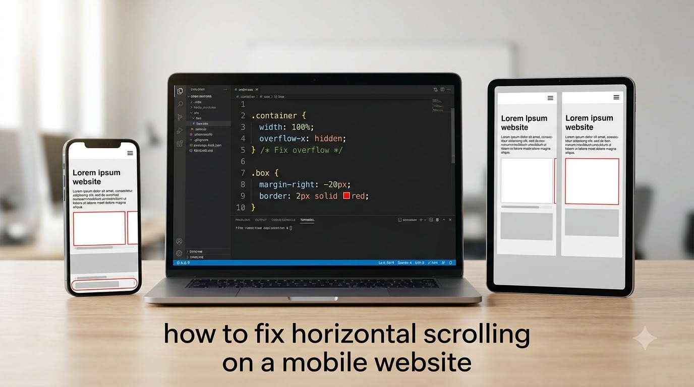
If you’ve ever opened a site on your phone and watched the page slide sideways, you already know how to spot horizontal scrolling on a mobile website. It’s the annoying swipe-left-and-right behavior that breaks the reading flow, hides menu buttons, and makes a design feel broken even when the desktop version looks perfect. I’ve spent more late nights than I care to count hunting down the rogue element that causes it, so I want to save you the same headache.
This guide walks you through exactly how to fix horizontal scrolling on a mobile website, from a one-line CSS patch all the way to a proper DevTools investigation. By the end, you’ll know what causes the overflow, how to find it, and how to stop it from coming back. Whether you’re using plain HTML, WordPress, Webflow, or Shopify, the same core principles apply.
Table of Contents
What Is Horizontal Scrolling on a Mobile Website?
Horizontal scrolling on a mobile website happens when webpage content is wider than the device’s viewport, forcing users to swipe sideways to see parts of the page that should fit on screen. The page is supposed to scroll only vertically, so any side-to-side movement is almost always a bug, not a design choice.
On a phone with a 360 to 414 pixel screen, your page width should match that range. When an element pushes past it, the browser creates a scroll region that lets users pan to see what got cut off. That’s the horizontal scroll we’re trying to eliminate, and it’s the symptom we’ll fix throughout this guide.
What Causes Horizontal Scroll on Mobile Devices?
There are five common culprits behind horizontal scroll on mobile, and almost every case I’ve debugged falls into one of these buckets. Run through them in order and you’ll usually find your problem within a few minutes.
Fixed-width elements that ignore the screen
A container set to width: 1200px or a logo image that’s 800px wide will always overflow on a 360px phone. Hard pixel widths don’t shrink, so the element sticks out past the viewport edge and drags the page with it.
Padding and margin overflow
If a section has padding: 0 80px on a 320px screen, the content area is forced to 480px wide. Without box-sizing: border-box, that padding is added on top of the declared width and instantly breaks the layout.
Missing or incorrect viewport meta tag
The viewport meta tag tells mobile browsers how to scale the page. Without it, the browser pretends it’s rendering a 980px desktop layout and squashes it down, which often produces ghost horizontal scroll and tiny text.
Unbreakable content like long URLs, code, or tables
A single long URL, a wide code block, or a non-responsive table can stretch its parent. Even if everything else fits, one wide child breaks the whole row.
Images, videos, and embeds without responsive sizing
Images without max-width: 100%, iframes with fixed pixel dimensions, and YouTube embeds without a wrapper will overflow the same way. This is the issue forum users report most often with WordPress themes.
How to Diagnose the Overflow With Chrome DevTools
The hardest part of fixing horizontal scroll on mobile isn’t the fix itself. It’s finding the element that’s too wide. Chrome DevTools gives you three quick ways to spot it.
Step 1: Switch to device emulation mode
Open DevTools with F12 or Cmd + Opt + I, then click the device toolbar icon (or press Cmd + Shift + M). Pick a common phone like iPhone 12 or Pixel 5. The viewport is now the same size your visitors see.
Step 2: Inspect computed widths
Hover over elements in the Elements panel and look at their computed widths in the Styles tab. Anything wider than the viewport width is a culprit. You can also paste this into the Console to log every element that’s overflowing:
document.querySelectorAll('*').forEach(el => { if (el.offsetWidth > document.documentElement.clientWidth) console.log(el); });
Step 3: Use the CSS outline trick
Many developers swear by this one-liner. Paste it into the Console to outline every element that’s wider than the body:
document.querySelectorAll('*').forEach(el => { el.style.outline = (el.offsetWidth > document.documentElement.clientWidth) ? '2px solid red' : ''; });
You’ll see red outlines around exactly the elements pushing past the viewport. That visual cue alone solves half the cases I’ve debugged.
How to Fix Horizontal Scrolling on a Mobile Website: Step-by-Step
Now that you know what’s wrong, here are the fixes in the order I apply them. Each step stacks on the previous one, so don’t skip ahead.
Step 1: Add or correct the viewport meta tag
Every responsive site needs this in the <head>:
<meta name="viewport" content="width=device-width, initial-scale=1.0">
This tells the browser to match the page width to the device width. Without it, mobile browsers assume a 980px viewport and zoom out, which is the root cause of the most confusing scroll cases.
Step 2: Apply overflow-x: hidden to html and body
This is the most-cited fix in every web design forum. Add this rule to your stylesheet:
html, body { overflow-x: hidden; }
It hides any horizontal overflow at the root, which immediately stops the side-to-side swipe. Forum users on Reddit’s r/css and r/web_design report this as the fix that finally ended their scroll headaches.
Step 3: Set box-sizing: border-box globally
Add this so padding and borders count inside the width instead of adding to it:
*, *::before, *::after { box-sizing: border-box; }
With this in place, a 100% wide element will stay 100% wide even after you add padding. It’s one of the safest defaults you can apply to any site.
Step 4: Constrain images, tables, and embeds
Forces every media element to respect its container:
img, video, iframe, table { max-width: 100%; height: auto; }
Tables are the sneaky ones. On desktop they’re 1200px wide, and on mobile they often stay 1200px unless you wrap them or add this rule. Pair it with word-break: break-word for unbreakable text inside cells.
Step 5: Remove fixed pixel widths from containers
Audit your CSS for any width: 1024px, min-width: 1200px, or hardcoded pixel values on outer wrappers. Replace them with max-width and percentage or vw units. A min-width on a body container is one of the most common causes I’ve seen, especially in legacy WordPress themes.
Common CSS Solutions Compared
There are three reasonable CSS-only approaches, and they’re not all equal. Here’s how they stack up.
overflow-x: hidden on html and body is the fastest fix and covers every overflow case. The downside is it can hide content that’s genuinely wider, like a wide table, so use it alongside responsive sizing rather than as a standalone solution.
overflow: hidden (both axes) stops both horizontal and vertical scroll, which is almost always wrong for a normal page. Skip this unless you’re building something like a full-screen modal.
max-width: 100% on every container is the cleanest long-term approach because it solves the root cause instead of hiding it. It’s also the slowest to apply because every container needs the rule.
My preferred stack is all three together: viewport meta tag, box-sizing: border-box, overflow-x: hidden on the root, and max-width: 100% on media. That combination resolves horizontal scroll on mobile for about 95% of sites I’ve worked on.
Browser-Specific Fixes (iOS Safari, Android Chrome)
iOS Safari has a long history of ignoring overflow-x: hidden in certain layouts, especially when the body has position: relative or when there’s a sticky header. If the standard fix doesn’t work on iPhone, add position: relative to the body element. Forum users on r/Wordpress confirm this combination works on stubborn Safari builds.
Android Chrome rarely has problems with overflow-x: hidden, but it sometimes produces ghost scroll when the page has horizontal momentum. The momentum scrolling fix is to add -webkit-overflow-scrolling: touch only where you actually want scrolling, like inside scrollable panels.
For older WebKit builds, you can also add the vendor-prefixed -webkit-overflow-scrolling property to the root element. Modern browsers ignore it, but legacy iOS respects it.
Preventative Measures and Best Practices
Once you’ve fixed the immediate overflow, a few habits keep it from coming back. First, build mobile-first. Write your CSS for a 320px screen first, then scale up with media queries. Most horizontal scroll bugs come from desktop-first thinking that was patched down instead of designed up.
Second, prefer relative units. Use %, vw, rem, and clamp() instead of pixel widths. Modern CSS gives you min(100%, 1200px) for elegant responsive caps that work across every screen size.
Third, wrap media in a container. Instead of dropping a YouTube embed directly into a post, wrap it in a div with position: relative; padding-bottom: 56.25%; and an absolutely positioned iframe. That pattern keeps any embed responsive regardless of platform.
Fourth, test on real devices. Chrome DevTools gets you 90% of the way, but the last 10% only shows up on an actual phone. I keep a small stack of old phones in my drawer just for this.
Finally, audit your theme. If you’re on WordPress, Divi, or Elementor, the builder itself often adds fixed-width containers in the header or footer. The logo and navigation menu are the most common culprits according to forum reports, so check those first.
Frequently Asked Questions
Why is my website scrolling horizontally?
Your website scrolls horizontally because at least one element is wider than the mobile viewport. The usual culprits are fixed-width containers, oversized images or iframes, long unbreakable text like URLs, tables without responsive styling, or padding and margin values that push content past the screen edge. Use Chrome DevTools to outline elements wider than the body and you will almost always spot the offender within a minute.
Why is my website not displaying properly on my mobile device?
The most common reason is a missing or incorrect viewport meta tag. Without , mobile browsers assume a 980px layout and shrink it down, which produces tiny text and horizontal scroll. Other causes include fixed pixel widths, images without max-width: 100%, and CSS that was written for desktop and never adapted for smaller screens.
Why does overflow-x: hidden not work on mobile?
overflow-x: hidden can fail on mobile when the offending element is inside a parent that also has overflow set, when the body uses position: relative, or when an iframe or sticky element is creating its own scroll region. The fix is to apply overflow-x: hidden to both html and body, add position: relative to the body, and audit any sticky headers or embedded media for inner overflow.
How do I stop horizontal scrolling on iPhone Safari?
On iPhone Safari, the most reliable fix is to combine three rules: add the viewport meta tag with width=device-width, apply overflow-x: hidden to both html and body, and set position: relative on the body. If a sticky header is involved, make sure the header also respects overflow-x: hidden. This combination covers the legacy WebKit quirks that ignore the standard overflow rule.
What causes horizontal scroll on mobile devices?
Horizontal scroll on mobile is almost always caused by content that exceeds the device viewport width. The five most common triggers are fixed pixel widths on containers, padding or margin values that push past 100%, oversized images or iframes without max-width: 100%, tables and long text that don’t break, and a missing viewport meta tag that makes the browser render a desktop layout at mobile size.
Conclusion
Horizontal scrolling on a mobile website is one of those bugs that looks random but is almost always the same handful of causes. Start with the viewport meta tag, add overflow-x: hidden to the root, set box-sizing: border-box globally, and constrain media with max-width: 100%. That stack kills the symptom.
For the root cause, use Chrome DevTools. The CSS outline trick is the fastest way to find which element is breaking your layout, and once you see it, the fix is usually a one-line change. From there, build mobile-first, prefer relative units, and wrap media in responsive containers so the issue never returns.
If you’ve been chasing horizontal scroll on mobile for weeks, this is the moment it ends. Save the DevTools snippet, apply the five-step fix, and your site will stay put no matter what phone your visitors use in 2026 and beyond.