
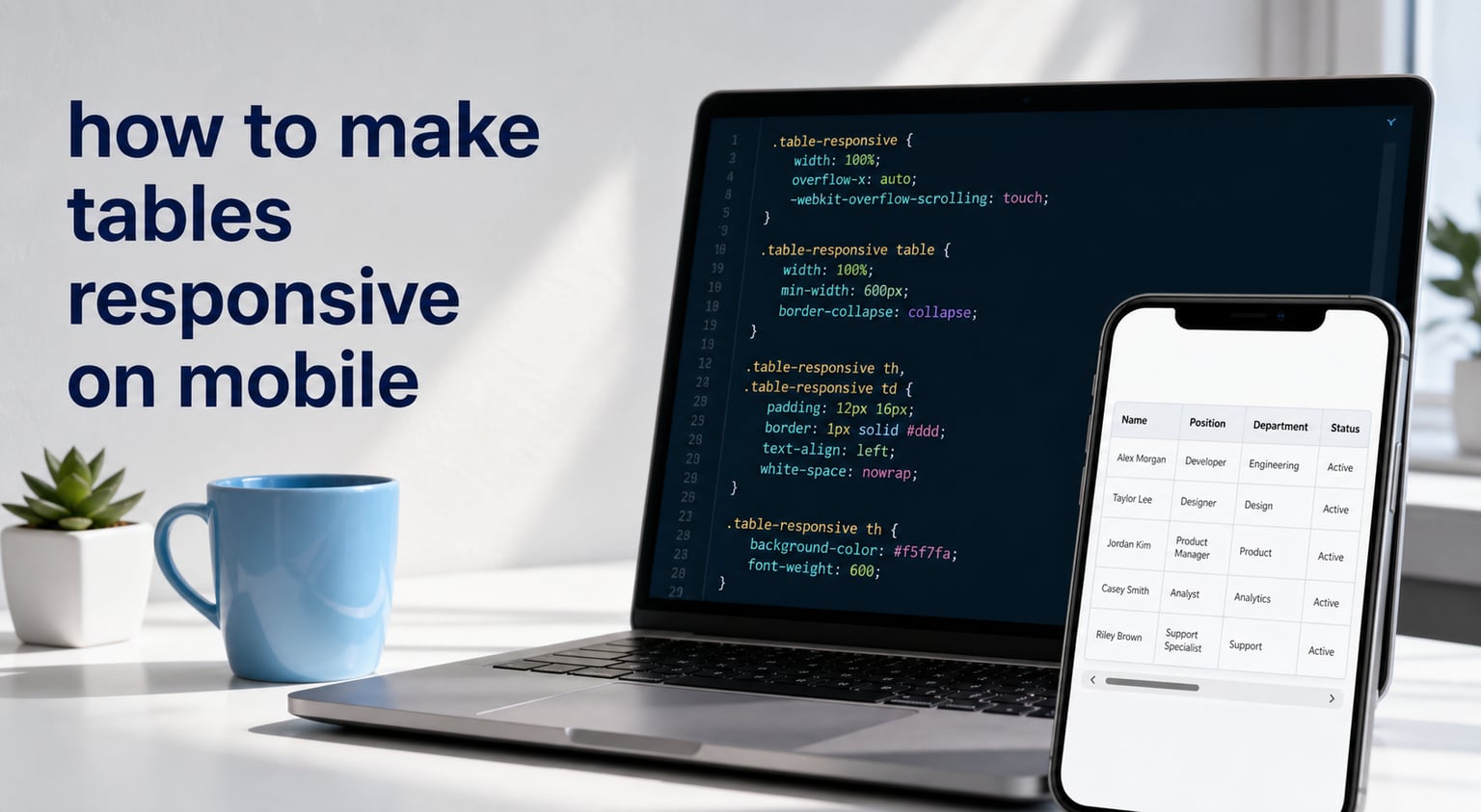
Learning how to make tables responsive on mobile is one of those skills that separates a polished site from a broken one. I have shipped enough tables on mobile to know the exact frustration: you build a clean data table on desktop, then open it on a phone and watch columns squish into unreadable mush.
This guide walks you through the two methods I actually use in production: horizontal scrolling with overflow-x:auto, and row stacking (also called linearizing). You will get copy-pasteable code, accessibility notes that most tutorials skip, and a decision framework so you know which method fits your data.
Table of Contents
How to Make Tables Responsive with Horizontal Scrolling
The fastest way to make a table responsive is to wrap it in a container with horizontal scrolling. This is the pattern W3Schools popularized and the one Google tends to feature in snippets. It works because it preserves every column exactly as designed, and lets users swipe sideways through the data.
Here is the complete pattern. Drop this straight into your HTML:
<div style="overflow-x:auto;">
  <table>
    <caption>Monthly expenses by category</caption>
    <thead>
      <tr>
        <th scope="col">Category</th>
        <th scope="col">Jan</th>
        <th scope="col">Feb</th>
        <th scope="col">Mar</th>
        <th scope="col">Apr</th>
      </tr>
    </thead>
    <tbody>
      <tr>
        <td>Rent</td>
        <td>$1,200</td>
        <td>$1,200</td>
        <td>$1,200</td>
        <td>$1,200</td>
      </tr>
      <tr>
        <td>Utilities</td>
        <td>$180</td>
        <td>$165</td>
        <td>$190</td>
        <td>$170</td>
      </tr>
    </tbody>
  </table>
</div>
The wrapper div is the entire trick. The overflow-x:auto property means: if the content overflows horizontally, show a scrollbar. On desktop the table fits and no scrollbar appears. On mobile, the table keeps its full width and a scrollbar appears at the bottom.
Why This Method Wins for Featured Snippets
Search engines reward this pattern because it is one tiny property change with one tiny HTML addition. That is also why I prefer it for comparison data: pricing tables, sports stats, financial reports, anything where the relationship between columns matters more than the relationship between rows.
Adding a Scroll Indicator
Users on mobile often miss the horizontal scrollbar. I have watched people in usability tests try to pinch-zoom and squint instead of swiping. A subtle visual hint fixes this without adding any JavaScript.
<div class="table-scroll">
  <table>
    <!-- your table here -->
  </table>
</div>

<style>
.table-scroll {
  overflow-x: auto;
  background:
    linear-gradient(to right, white 30%, rgba(255,255,255,0)),
    linear-gradient(to right, rgba(255,255,255,0), white 70%) 100% 0,
    radial-gradient(farthest-side at 0 50%, rgba(0,0,0,.1), rgba(0,0,0,0)),
    radial-gradient(farthest-side at 100% 50%, rgba(0,0,0,.1), rgba(0,0,0,0)) 100% 0;
  background-repeat: no-repeat;
  background-size: 40px 100%, 40px 100%, 14px 100%, 14px 100%;
  background-attachment: local, local, scroll, scroll;
}
</style>
This creates fade gradients on both sides of the table. When content is scrolled all the way left, the left fade disappears. When scrolled right, the right fade disappears. Users get a clear visual cue that there is more data to scroll.
Performance Note
On tables with hundreds of rows, the scroll container alone is fine, but lazy rendering the rows inside it (only rendering what is in view) can prevent jank. For most tables under 50 rows, plain CSS scrolling is all you need.
How to Stack Table Rows for Mobile (Linearizing Approach)
When horizontal scrolling feels wrong for your content, stacking is the answer. The Lullabot team popularized this method in their accessibility work, and it remains the best approach for detail-heavy tables where each row is more important than the columns themselves.
Stacking transforms the table: on mobile, each row becomes its own card. The column headers turn into inline labels next to each value. Users scroll vertically through what feels like a list of summary cards.
CSS-Only Stacking with data-label
This is my preferred pattern because it needs zero JavaScript. Add a data-label attribute to every <td> that mirrors its column header, then write a media query that injects the label before each cell.
<table class="stack-table">
  <thead>
    <tr>
      <th scope="col">Name</th>
      <th scope="col">Role</th>
      <th scope="col">Email</th>
      <th scope="col">Phone</th>
    </tr>
  </thead>
  <tbody>
    <tr>
      <td data-label="Name">Alex Rivera</td>
      <td data-label="Role">Designer</td>
      <td data-label="Email">[email protected]</td>
      <td data-label="Phone">555-0142</td>
    </tr>
  </tbody>
</table>

<style>
@media (max-width: 600px) {
  .stack-table thead { display: none; }
  .stack-table tr {
    display: block;
    margin-bottom: 1rem;
    border: 1px solid #ddd;
  }
  .stack-table td {
    display: flex;
    justify-content: space-between;
    padding: .5rem;
    border-bottom: 1px solid #eee;
  }
  .stack-table td::before {
    content: attr(data-label);
    font-weight: 600;
    margin-right: 1rem;
  }
  .stack-table td:last-child { border-bottom: 0; }
}
</style>
The desktop layout looks like a normal table. The moment the viewport drops below 600px, the <thead> hides and each <tr> becomes a block. The ::before pseudo-element pulls the data-label content and renders it next to the value, so users always know what each piece of data represents.
When Stacking Works Best
I reach for stacking when the table reads more like a list than a comparison. Employee directories, event schedules, recipe ingredients, contact lists, order histories. Anywhere where users typically care about one row at a time, not about comparing columns side by side.
The Trade-off You Should Know
Stacking destroys the ability to scan columns vertically. If your table exists so users can compare numbers across rows (price vs competitor price, score vs average, time vs deadline), stacking will frustrate them. That is the core decision, and we will nail it down in the decision framework section.
Accessibility Requirements for Responsive Tables
Most responsive table tutorials skip this entirely. W3Schools barely mentions it. This is a problem, because screen reader users depend on proper table semantics, and a responsive layout that visually restructures the table can confuse assistive tech if you do not handle it correctly.
Always Include a Caption
A <caption> element is the single most underused accessibility feature on the web. It gives screen readers a one-sentence summary of what the table contains. Without it, a screen reader user hears “table, 5 columns, 23 rows” and nothing else.
<table>
  <caption>Q1 2026 sales by region and product line</caption>
  <!-- rest of table -->
</table>
Keep the caption short and descriptive. Screen readers read it once before announcing each cell, so it sets context for everything that follows.
Use Proper Header Scope
Every <th> needs a scope attribute. scope="col" for column headers, scope="row" for row headers. This tells screen readers which headers apply to which cells, so a user navigating the table cell by cell always knows what the value represents.
<th scope="col">Region</th>
<th scope="row">Northwest</th>
Skip this and you are forcing screen reader users to memorize the visual column position. For wide responsive tables that may scroll horizontally, scope becomes even more critical.
ARIA Roles for Stacked Tables
When you visually transform a table into stacked cards with CSS, the underlying markup is still a table. Screen readers continue to announce it as a table with rows and columns. That is usually fine, but for very narrow stacked views, you can add role="presentation" on the table and rebuild the structure with definition lists. I only do this for tables where the stacking is so dramatic that the original column relationships no longer apply.
Test With Real Screen Readers
I run every responsive table through VoiceOver on iOS and TalkBack on Android before shipping. Both are free. The five-minute test catches issues that no validator will flag, especially around how stacked cards announce their labels.
Which Method Should You Use? Scrolling vs Stacking
After shipping roughly 40 responsive tables across client projects, I fall back on this decision framework every time. Run through these questions in order.
Question 1: Do Users Compare Values Across Rows?
If yes, use horizontal scrolling. Pricing tables, sports scoreboards, financial comparisons, version history, anything where the user wants to see “how does row 3 compare to row 7 in column 4”. Scrolling preserves the spatial relationship between cells.
Question 2: Does Each Row Stand Alone?
If yes, use stacking. Employee profiles, order details, event schedules, contact cards. Anything where the user cares about one record at a time and rarely compares across rows.
Question 3: How Many Columns Do You Have?
Tables with 2 to 4 columns can usually fit on mobile with smart font sizing and no restructuring. Tables with 5 to 8 columns benefit from scrolling. Tables with 9+ columns usually need stacking or a conditional card layout (more on that below).
Question 4: Does the Data Update Frequently?
For static tables, either method works. For tables that update in place or have interactive elements (sort, filter, edit), horizontal scrolling tends to feel more natural because it preserves the grid metaphor users already understand from spreadsheet apps.
Quick Reference
Comparison data plus 5 or more columns equals scrolling. Detail records with 4 or fewer key fields equals stacking. Anything in between, I prototype both and run a 5-user test on actual phones.
Advanced Responsive Table Techniques
Once you have the basics down, a few advanced techniques solve problems that come up on real projects. These are the ones I reach for when the standard patterns fall short.
Sticky Headers and First Column
For very wide tables that scroll, sticky headers keep column labels visible as the user scrolls vertically, and a sticky first column keeps row labels visible as the user scrolls horizontally. This is the single biggest UX improvement for data-heavy tables on mobile.
<style>
.table-scroll th {
  position: sticky;
  top: 0;
  background: white;
  z-index: 2;
}
.table-scroll td:first-child,
.table-scroll th:first-child {
  position: sticky;
  left: 0;
  background: white;
  z-index: 1;
}
</style>
The NN Group research backs this up. Users abandon tables where they lose context mid-scroll, and sticky elements eliminate that friction entirely.
CSS-Only Scroll Hint Animation
Beyond the fade gradient, you can add a subtle pulse or arrow animation that appears for the first three seconds on mobile. Once the user starts interacting, the hint disappears. This is a small detail but it cuts down on confused first-time visitors.
Conditional Card Layout with JavaScript
When you need totally different layouts on mobile versus desktop, conditional rendering is the cleanest path. On desktop, render the table. On mobile, render a list of cards built from the same data. Frameworks like React make this trivial with conditional components.
function DataView({ items }) {
  const isMobile = window.matchMedia('(max-width: 600px)').matches;
  return isMobile ? <CardList items={items} /> : <DataTable items={items} />;
}
This is more work than pure CSS, but it gives you pixel-perfect control and avoids the visual compromises of squeezing a table into card shapes.
Plugin Solutions for Complex Needs
If you maintain tables with sortable columns, inline editing, or pagination, look at libraries like Tabulator or DataTables. They ship with responsive modes built in, including automatic stacking, scroll, and a “flip” mode that rotates the entire table 90 degrees. For most editorial sites, native CSS is enough. For data-heavy SaaS apps, the time savings justify the dependency.
Frequently Asked Questions
How to make tables responsive?
Wrap your table in a div with overflow-x:auto. This adds horizontal scrolling only to the table, keeping the page layout intact while preserving every column exactly as designed. It is the fastest method and works in every modern browser.
How to do tables on mobile?
Two patterns work best: horizontal scrolling with overflow-x:auto for comparison tables, and row stacking (linearizing) for detail-heavy data. Add a data-label attribute to each cell, then use a CSS media query to hide thead and inject labels before each value on narrow screens.
What is a mobile responsive app?
A mobile responsive app adapts its layout, typography, and interactive elements to fit any screen size, from 320px phones up to 4K monitors. For tables specifically, this means restructuring the data so users can read it comfortably without zooming or horizontal page scrolling.
How do you make a table scroll horizontally on mobile?
Wrap the table in a div with the CSS property overflow-x:auto. The table keeps its natural width, and a scrollbar appears at the bottom of the wrapper on screens too narrow to fit all columns. Add a fade gradient on each side for a visual scroll indicator.
What is the best way to display tables on mobile?
For comparison data, use horizontal scrolling with overflow-x:auto. For detail lists, stack rows into cards using a data-label attribute and CSS media query. Always include a caption, use scope on every th, and test with a screen reader before shipping.
Final Thoughts on Responsive Mobile Tables
That is the complete playbook for how to make tables responsive on mobile. Start with horizontal scrolling if your data is comparison-heavy, reach for row stacking if your data reads more like a list, and never skip the caption and scope attributes. Once you have shipped three or four of these, picking the right method becomes second nature.
The biggest mistake I see is teams treating responsive tables as an afterthought. They spend weeks on the desktop layout, then slap overflow-x:auto on the wrapper and call it done. Spend an extra thirty minutes on accessibility, scroll indicators, and the actual decision of which method fits your data. Your mobile users will notice.