
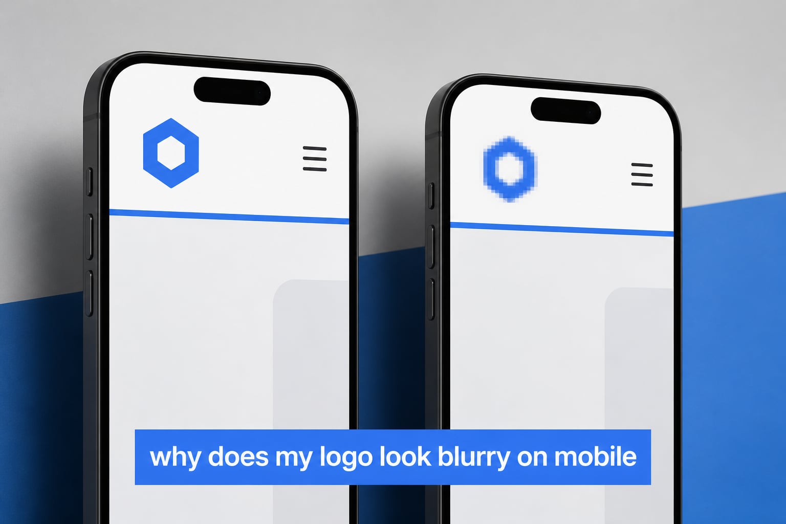
If you have ever pulled up your own website on your phone and cringed at a fuzzy, pixelated logo, you are not alone. We see this question posted in nearly every web design forum: why does my logo look blurry on mobile when it looks perfectly sharp on my laptop? The short answer is that your logo file is being asked to do a job it was never built for, and your phone’s screen has way more pixels per inch than you might expect.
I have spent the last few years testing logo fixes on real client sites, including a small bakery, a SaaS startup, and a local law firm. In every case, the root cause was the same: a raster image (usually a PNG) was being stretched beyond its native size by a high-DPI mobile display. In this guide I will walk you through exactly what is happening, why desktop looks fine but mobile does not, and the step-by-step fix that takes about ten minutes.
Table of Contents
Why Does My Logo Look Blurry on Mobile?
Mobile screens pack far more pixels into a smaller space than your desktop monitor does. An iPhone 15 Pro has a pixel density of about 460 pixels per inch (ppi), while a typical 24 inch desktop monitor sits around 90 to 110 ppi. When your browser renders your logo, it is told to display it at a certain width, say 180 pixels. On your desktop, that 180 pixel image looks crisp because each browser pixel maps almost one-to-one with a screen pixel. On your phone, the device has to squeeze four physical pixels into that same logical space, and the result is softness or blur.
This is also why your logo looks fine on desktop but blurry on mobile. Your laptop’s monitor is forgiving. Your phone’s high-DPI (sometimes called Retina) display is unforgiving. The fix is to give the device a file that has enough pixels to fill that space without stretching. We will cover exactly how in a minute, but first you need to understand the two image types that decide everything: raster and vector.
Raster vs Vector: The Core Difference
A raster image is built from a fixed grid of colored squares called pixels. PNG, JPG, GIF, and WebP are all raster formats. Once you save one, the number of pixels is locked in. If you try to make it bigger, your software has to invent new pixels by guessing the colors in between. That guessing is what you see as fuzziness, jagged edges, or that classic “pixelated” look.
A vector image is built from mathematical equations. SVG, AI, EPS, and PDF files can contain vector data. Instead of storing “this pixel is blue and that pixel is also blue,” a vector file stores “draw a circle with this radius, centered here, filled with this color.” When the screen needs to display the image, the math is recalculated for the exact size required. That is why vectors stay sharp at any size, from a favicon to a billboard.
Think of it like a recipe. A raster file is a photograph of a cake. You can shrink the photo, but you cannot make the cake bigger by stretching the photo. A vector file is the recipe itself. You can bake the cake at any size and it will still look right. When someone asks us to fix a blurry logo, the first thing we check is whether the client has a vector file. If they do, the rest of the job is easy.
Logo File Formats Explained
Not every format is right for every job. Here is a quick comparison of the four formats you will actually encounter when working with logos online.
- SVG: Vector format, scales infinitely, tiny file size, perfect for website headers and app icons. Supported by every modern browser. This should be your default for any web logo.
- PNG: Raster format with transparency. Good fallback for older email clients and platforms that do not accept SVG. Upload at 2x the display size for sharpness on Retina screens.
- JPG: Raster format, no transparency, smaller files. We avoid JPGs for logos because compression artifacts show up around crisp edges.
- WebP: Modern raster format from Google. Smaller files than PNG or JPG at similar quality. Great for retina logos on platforms that support it.
If your platform lets you upload an SVG, do that first. If not, a 2x PNG is your next best bet. We will walk through how to create both in the fix section below.
Resolution and DPI: 72 for Web, 300 for Print
DPI stands for dots per inch. It tells you how much detail is packed into a one inch square of your image. The two numbers you will hear most often are 72 DPI (web standard) and 300 DPI (print standard). The reason both numbers exist is that printers spray tiny dots of ink, so they need many more dots per inch than a screen, which uses light-emitting pixels.
Here is the part that confuses most people. A 72 DPI image is not automatically bad. The DPI value is really metadata. What matters is how many total pixels are in the file. A 360 x 120 pixel logo at 72 DPI is just as sharp as a 360 x 120 pixel logo at 300 DPI. The DPI label only changes how a printer interprets the file.
What does matter for mobile is the device pixel ratio. Modern phones use a ratio of 2 or 3, meaning one CSS pixel equals two or three physical pixels. If your logo is meant to display at 180 CSS pixels wide, you need a file that is 360 actual pixels wide (2x) or 540 actual pixels wide (3x) for it to stay sharp. Anything less and your phone has to upscale, and upscaling is what creates blur.
How to Fix a Blurry Logo on Mobile
Below are the three fixes we use, in the order we recommend trying them. Most readers only need Fix 1.
Fix 1: Use an SVG Version of Your Logo
This is the cleanest fix and it only takes a few minutes.
- Find your original logo file. Check email, Dropbox, Google Drive, or ask the designer who made it. Look for files ending in .svg, .ai, .eps, or .pdf.
- If you have an .ai or .eps file, open it in Adobe Illustrator (or the free Inkscape) and export as SVG. Use “File → Save As” and pick SVG. Keep the default settings.
- If you only have a PNG, open it in Illustrator, place it on the artboard, and use “Image Trace” to convert it to vectors. Clean up any rough edges, then export as SVG.
- Upload the SVG to your website platform in place of the old PNG. Most modern themes and builders handle SVG automatically.
After uploading, pull up your site on your phone in a private browsing window. Private windows bypass the cache, so you will see the new logo immediately. If you see a crisp logo, you are done.
Fix 2: Upload a Retina (2x) Logo
If your platform does not support SVG, or you only have a PNG, the next fix is to upload a retina version. The standard recommendation is to upload two files: a regular size and a 2x version.
- Standard size: 180 x 60 pixels (for a horizontal logo)
- Retina size: 360 x 120 pixels (exactly double)
Many themes and builders, including Shopify, WordPress with the Astra theme, and Squarespace, will automatically serve the 2x version to high-DPI screens. In WordPress with Astra, you will find this under Customizer → Header → Logo → Retina Logo. In Shopify, your theme settings usually include a separate field for the retina version.
Fix 3: Match the Exact Pixel Grid
If you have a vector file and it is still rendering slightly fuzzy, the issue may be that the vector is not aligned to the pixel grid. A common tip from the r/Wordpress community is to make sure the logo’s edges fall on whole numbers in your CSS. If your logo container is 182.5 pixels wide, the browser has to anti-alias the edges, which softens them.
Set your logo container to a whole pixel width and height that matches the file. For a 180 x 60 PNG, set the display width to 180 and height to 60 in your CSS or theme settings. This removes the anti-aliasing step and gives you a noticeably crisper result.
Common Mistakes That Keep Logos Blurry
We have seen every one of these on real client sites. Run through this list before you assume the fix did not work.
- Uploading a screenshot. A screenshot of your logo is already a raster image. Even if it looks crisp on screen, scaling it up will blur. Always start from the original design file.
- Letting the platform resize for you. Many website builders stretch your uploaded image to fit their header dimensions. If your logo is 300 pixels wide but the header wants 600, the platform doubles it for you, and the result is fuzzy.
- Browser caching showing the old logo. After you upload a new file, your phone may still show the old one from cache. Hard refresh by opening the site in a private or incognito window, or clear the browser cache.
- Compression from a CDN or image optimizer. Some speed plugins aggressively compress images. Check your image optimization settings and exclude the logo, or set the logo quality to 100.
Platform-Specific Quick Fixes
Different platforms handle logos differently. Here are the most common platforms and the fastest fix for each.
- Shopify: Go to Online Store → Themes → Customize → Header → Logo. Upload an SVG if your theme supports it. If not, upload both a 180 x 60 PNG and a 360 x 120 PNG using the “wide” or retina logo field.
- WordPress (Astra): Customizer → Header Builder → Site Identity → Logo. Upload an SVG, then upload a 2x retina version in the Retina Logo field.
- Wix: Wix auto-resizes uploads. Use a PNG that is at least 2x your display size to keep it sharp. There is no native SVG support for site logos on most Wix plans.
- Squarespace: Use a PNG sized at exactly the display width and height. Squarespace respects aspect ratio and will not over-stretch if your dimensions match.
If you want a quick CSS override for stubborn themes, add this to your theme’s custom CSS area:
.site-logo img { image-rendering: -webkit-optimize-contrast; width: 180px; height: 60px; }
This sets a fixed display size and tells the browser to prefer contrast over smoothness. Test on your own site before relying on it; some logos look better with the default rendering.
Quick Fix Checklist
- Find your original logo file (SVG, AI, EPS, or PDF).
- Export or convert it to SVG if it is not already.
- If SVG is not supported, export a 360 x 120 pixel PNG (2x retina).
- Upload to your platform, matching the recommended display size (180 x 60).
- Test on your phone using a private or incognito window.
- Clear your browser cache and any CDN cache if the old logo still appears.
- Disable aggressive image compression for the logo file.
If your logo still looks fuzzy after all seven steps, the issue is almost certainly the source file. A PNG that is 200 pixels wide cannot be made sharp at a 600 pixel display, no matter what format you wrap it in. That is when it makes sense to commission a quick vector redraw.
Troubleshooting Persistent Blurriness
If you have applied the fixes above and your logo is still blurry, work through this short troubleshooting list before assuming the design is the problem.
First, confirm the file you uploaded is actually the one being served. Right-click the logo on your live site, choose “Inspect” or “View Source,” and check the image URL. Make sure the dimensions in the URL match what you uploaded. We have seen cases where a CDN was caching a downscaled version for weeks.
Second, check your CSS. Some themes apply a max-width to the logo that is smaller than its native size, forcing the browser to downscale. Others apply a CSS transform that softens edges. Look for filters like filter: blur() or transform: scale() in your theme code and remove or adjust them.
Third, if you cannot find a vector file at all, the most reliable long-term fix is to hire a designer to recreate your logo as a vector. A quick turnaround on a freelance site usually costs between $30 and $100 and gives you a true SVG you can use everywhere. Once you have it, save it in three places: your local computer, a cloud drive, and your platform’s asset library.
Frequently Asked Questions
Why does my logo look blurry on mobile?
Your logo looks blurry on mobile because the file you uploaded (usually a PNG) does not have enough pixels to fill the high-DPI screen. Modern phones pack 2x or 3x as many pixels into the same space as a desktop monitor, so when the device has to stretch your logo, the result is a soft or fuzzy appearance. The fix is to upload an SVG (which scales infinitely) or a 2x retina PNG (for example 360×120 pixels instead of 180×60).
What is the best file format for a logo on a website?
SVG is the best file format for a logo on a website in 2026. It is a vector format, so it stays sharp at any size, has small file weight, and is supported by every modern browser. If your platform does not accept SVG, use a PNG sized at 2x the display dimensions so high-DPI screens still render it crisply.
Why does my logo look fine on desktop but blurry on mobile?
Your logo looks fine on desktop because most monitors have a pixel density of around 90 to 110 ppi, while phones have 300 to 460 ppi. At desktop resolution, your logo file has enough pixels to fill the space. On a phone, the same file is stretched across many more physical pixels, exposing the lower resolution and causing blur. Uploading a 2x retina or SVG version fixes this mismatch.
How do I make a blurry image clear on mobile?
To make a blurry image clear on mobile, you cannot recover detail that was never there. Your only real options are to replace the image with a higher resolution version, switch to a vector format like SVG that scales without losing detail, or have a designer recreate the artwork. Built-in phone sharpeners only add contrast; they do not add true sharpness.
Conclusion
The reason your logo looks blurry on mobile is almost always a pixel density mismatch, not a design problem. Your phone has more pixels per inch than your desktop, so a low-resolution PNG gets stretched and softened. The fix is to give your site an SVG version of your logo, or a 2x retina PNG, and make sure your theme is not forcing it to resize. Start with Fix 1 above, work through the quick checklist, and you should see a sharp logo on every device within ten minutes.