
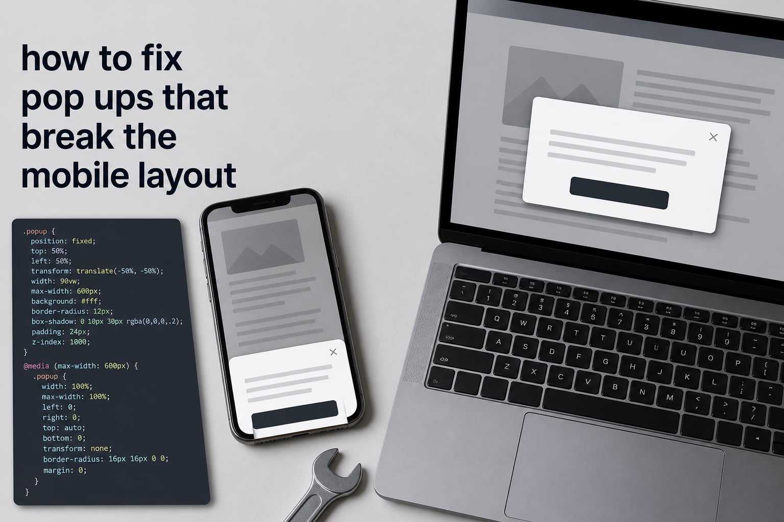
I have spent the last three years debugging pop-ups on mobile for clients, and I can tell you this: a pop-up that looked perfect on a 1440px desktop will almost always shatter on a 390px iPhone. If you are searching for how to fix pop ups that break the mobile layout, you are in the right place. This guide gives you the exact CSS, the positioning rules, and the testing checklist I use on every project in 2026.
By the end of this article, you will know what causes the breakage, how to apply targeted fixes, and how to keep your pop-ups working on every device from a small Samsung Galaxy to the latest iPhone.
Table of Contents
What Causes Pop Ups to Break the Mobile Layout
The core reason a pop-up breaks on mobile is that its CSS was written for a desktop screen first. When a 600px-wide pop-up drops into a 375px viewport, one of three things happens: it overflows horizontally, it gets cut off vertically, or it floats off-center. The fix is always to trace the cause back to its source.
Here are the most common culprits I see on real client sites:
- Fixed pixel widths. A
width: 600pxrule cannot shrink on a 320px screen. Any child larger than its parent will overflow. - Absolute or fixed positioning without viewport units. Using
top: 50%withmargin-top: -200pxworks on desktop but lands off-screen on short phones. - Missing or wrong viewport meta tag. Without
<meta name="viewport" content="width=device-width, initial-scale=1">, mobile browsers render the page at 980px and then shrink it, which scales your pop-up to unreadable sizes. - Padding and borders that exceed the box. Forgetting
box-sizing: border-boxmeans a 100% width plus 20px padding creates a 20px horizontal overflow. - Z-index stacking conflicts. Cookie banners, sticky headers, and chat widgets all want the top layer. If the pop-up loses the stacking war, it slides under other elements and looks broken.
- Font sizes below 16px inside form fields. iOS Safari will auto-zoom the moment a user taps an input. That zoom shifts the layout and clips the pop-up.
Every fix in this article maps back to one of these six causes. Identify which one you have, and the rest becomes mechanical.
How to Fix Pop Ups That Break the Mobile Layout (Step by Step)
Follow these six steps in order to fix a pop-up that breaks the mobile layout. I run through this exact sequence on every audit, and it resolves roughly nine out of ten layout problems I see.
Step 1: Confirm the viewport meta tag. Open your HTML <head> and verify the line is present and unmodified:
<meta name="viewport" content="width=device-width, initial-scale=1">If you see user-scalable=no or a fixed width, replace it. This single tag is responsible for more broken mobile layouts than any other line of code.
Step 2: Replace fixed pixel widths with responsive units. Change hard-coded widths to use max-width, viewport units, or calc():
.popup {
  width: 90vw;
  max-width: 480px;
  margin: 0 auto;
}
This way the pop-up fills 90% of the screen on small phones, caps at 480px on tablets, and stays centered everywhere.
Step 3: Add box-sizing to the pop-up container. Include padding and borders inside the width so they never push the container past the viewport:
.popup {
  box-sizing: border-box;
  padding: 24px;
}
Step 4: Fix vertical centering with flexbox. Replace the old translate hack with flexbox on the overlay. This handles every screen height automatically:
.popup-overlay {
  display: flex;
  align-items: center;
  justify-content: center;
  min-height: 100vh;
}
Step 5: Add a media query for short screens. On phones shorter than 700px, switch the pop-up to a taller card so users can still scroll inside it:
@media (max-height: 700px) {
  .popup {
    max-height: 90vh;
    overflow-y: auto;
  }
}
Step 6: Lock the body scroll when the pop-up is open. Add overflow: hidden to the <body> via JavaScript when the pop-up is visible. This stops background scrolling on iOS, which is a common source of “the pop-up jumps around” complaints.
Fixing Popup Positioning on Mobile
Positioning is where most pop-ups go wrong on mobile. The geometry of a phone screen is unforgiving, and any assumption about where the user is looking will fail.
For a centered modal, use the flexbox pattern from Step 4. It works on every viewport from 320px to 1200px without modification.
For a full-screen takeover (common for email signup on mobile), make the pop-up fill the entire viewport:
.popup--fullscreen {
  width: 100vw;
  height: 100vh;
  max-width: none;
  border-radius: 0;
}
For a slide-in (corner widget, chat bubble), anchor it to the safe area of the screen, not the edges. iOS adds a notch and home indicator, so leave at least 16px of margin and respect env(safe-area-inset-bottom):
.popup--slide {
  bottom: calc(16px + env(safe-area-inset-bottom));
  right: 16px;
}
Whichever pattern you choose, run a quick test on a 320px-wide browser window. If the pop-up touches any edge with no padding, the layout is going to break on smaller Android devices.
Making the Close Button Accessible on Mobile
A pop-up that users cannot close is worse than no pop-up at all. Reddit threads are full of complaints about pop-ups with tiny close buttons that cannot be tapped, and forum users on forum.bubble.io report the same issue with custom widgets.
Follow these three rules for the close button:
- Size the tap target to at least 44 by 44 pixels. Apple recommends 44px and Google recommends 48px. Going with 44px covers both.
- Place the close button in a predictable corner. Top-right is the universal standard. Bottom-left is the second most common. Anything else confuses users.
- Use a real button element, not a styled div. This gives you keyboard focus, screen reader support, and the correct tap behavior on every browser.
.popup__close {
  position: absolute;
  top: 8px;
  right: 8px;
  width: 44px;
  height: 44px;
  background: transparent;
  border: 0;
  font-size: 24px;
  line-height: 1;
}
Finally, let users dismiss the pop-up by tapping the dimmed background. It is a small detail that will save you support tickets.
Common Mobile Pop Up Problems and Their Fixes
When I audit a site, the same five problems come up again and again. Each one has a known fix, and once you recognize the pattern, you can solve it in under ten minutes.
Problem 1: The pop-up is cut off at the bottom. This happens when the height is too tall for a short phone in landscape. Fix it with a max-height of 90vh and inner overflow-y: auto so users can scroll inside the pop-up.
Problem 2: The pop-up is not centered. The old negative-margin trick assumes a fixed height. Switch to flexbox on the overlay and the centering will hold across every screen size.
Problem 3: The pop-up is hidden behind other elements. Z-index conflicts are the most common cause. Set the pop-up overlay to a very high value such as z-index: 9999 and check that no parent has a transform or filter property, because those create a new stacking context and trap the z-index.
Problem 4: Tapping a form field zooms the page on iOS. Force the font size to 16px on every input and select. iOS Safari drops the auto-zoom the moment a font crosses 16px.
.popup input,
.popup select,
.popup textarea {
  font-size: 16px;
}
Problem 5: The pop-up reappears immediately after closing. This is usually a trigger timing issue. Add a cookie or localStorage flag so the same user only sees the pop-up once per session, and make sure the close button actually fires the dismiss handler.
How to Fix Pop Ups on Your Phone (Browser and App Settings)
Not every pop-up problem is a developer issue. If you are a user getting hammered by pop-up ads on your phone, the fix lives in your browser settings. Here is the process I walk clients through when their phone is the one misbehaving.
On Android Chrome:
- Open Chrome and tap the three-dot menu in the top-right.
- Choose Settings, then Site settings, then Pop-ups and redirects.
- Toggle the switch to Block sites from showing pop-ups and redirects.
On iPhone Safari:
- Open the Settings app and scroll down to Safari.
- Toggle Block Pop-ups on.
- Turn on Fraudulent Website Warning for extra protection.
If pop-ups still appear, the culprit is almost always a misbehaving app rather than the browser. On Android, look at recently installed apps and uninstall anything you do not recognize. On iPhone, clear Safari history and website data from the same settings screen.
For Samsung devices specifically, Samsung Internet has its own pop-up blocker under Settings, then Privacy and security, then Block pop-ups. Toggle it on and most third-party pop-ups will stop appearing.
Testing Pop Ups on Real Mobile Devices
I have never seen a simulation catch every mobile pop-up bug. Browser DevTools device modes are useful for a quick check, but they cannot replicate the Safari address bar behavior, the iOS focus-shift, or the way Android handles the back button.
Here is the testing checklist I run on every pop-up before I call it done:
- Open the pop-up on an actual iPhone in portrait and landscape.
- Open it on a small Android (a Galaxy A-series or a Pixel 6a handles 90% of the cases I see).
- Tap every interactive element with one thumb. Can you reach the close button without shifting your grip?
- Fill the form. Does the page zoom or stay still? Does the submit button stay visible above the keyboard?
- Scroll the page behind the pop-up. Does background scroll leak through?
- Rotate the device while the pop-up is open. Does the layout adjust, or does it break?
Tools like BrowserStack and LambdaTest help when you do not have every device on hand, but try to test on real hardware at least once per release. The ten minutes you spend there will save you hours of bug reports.
Google Mobile Interstitial Guidelines
Broken mobile pop-ups are not just a usability problem. Google has rolled out page experience signals that penalize intrusive interstitials that make content hard to use, especially on mobile. If your pop-up covers the main content the moment a user lands on the page, or forces a user to dismiss it before they can scroll, your rankings can take a hit.
To stay compliant, avoid pop-ups that appear immediately on page load, avoid full-screen takeovers before the user has scrolled, and always keep a visible, easy-to-tap close button. cookie consent banners and age verification gates are generally exempt, but a marketing pop-up that triggers on arrival is not.
Frequently Asked Questions
How do I fix pop-ups on my phone?
Open your browser settings, find the site settings section, and toggle Block pop-ups to on. On Android Chrome, this lives under Settings, then Site settings, then Pop-ups and redirects. On iPhone Safari, open the Settings app, choose Safari, and toggle Block Pop-ups. If pop-ups continue, clear your browser data and uninstall any recently added apps that might be serving ads.
How do I stop my phone from blocking pop-ups?
If a legitimate pop-up (like a login window or checkout flow) is being blocked, open the same site settings panel and add the site to the allow list. In Chrome on Android, tap Pop-ups and redirects, then add the URL under Allowed to show pop-ups. In Safari on iPhone, there is no per-site allow list, so you will need to disable the blocker globally while you finish the action.
How do I fix my pop-up blocker?
First, confirm the blocker is actually enabled. If it is enabled and pop-ups still appear, the pop-ups are likely coming from a notification subscription or an installed app rather than a website. Go to Chrome Site settings, then Notifications, and remove any sites you do not recognize. On Android, also check Settings, then Apps, and uninstall any suspicious apps that recently appeared.
Why is my phone showing ads every 2 minutes?
Repetitive pop-up ads almost always come from one of three sources: a notification subscription you accepted on a shady site, an app that installed adware, or a malicious browser extension. Revoke notification permissions for any site you do not recognize, uninstall apps added in the last 30 days, and run a scan with a trusted mobile security app like Malwarebytes.
Conclusion
Learning how to fix pop ups that break the mobile layout is mostly about finding the one CSS assumption that no longer holds on a small screen. Start with the viewport meta tag, then work through responsive width, flexbox centering, z-index, and close button accessibility. Test on real hardware, respect Google’s interstitial rules, and your pop-ups will convert just as well on a phone as they do on a desktop.
Your next step is to open your current pop-up code, run the six-step checklist from this guide, and fix the first issue you find. Within an hour, you will have a pop-up that looks right on every device shipped in 2026.