
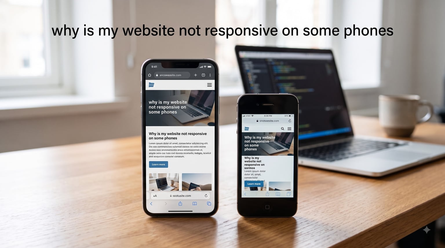
I’ve been building websites for over a decade, and the question “why is my website not responsive on some phones” is one I hear constantly from readers, clients, and developers in our community. Just last month, a small business owner emailed me in a panic because her site looked perfect on her iPhone 14 but completely broken on her husband’s older Android.
If you’re staring at your phone right now wondering why your carefully built site looks like a disaster on some devices while working fine on others, you’re not alone. This guide walks you through every common cause I have personally diagnosed, and the fixes that actually work. By the end, you’ll know exactly which lever to pull to make your website responsive on every phone that visits it.
Table of Contents
Why Is My Website Not Responsive on Some Phones? The Core Problem Explained
Your website is not responsive on some phones because of mismatches between how your code expects to render and how specific mobile browsers actually render. The most common causes are a missing or misconfigured viewport meta tag, CSS media queries that don’t cover all device widths, unoptimized images, and platform-specific quirks between iPhone Safari and Android Chrome.
Mobile devices vary wildly in screen width, pixel density, browser engine version, and default zoom behavior. A site that works on a brand-new iPhone may look broken on a three-year-old Android because the CSS layout targets one width and the other phone reports a different effective width to the browser. Add browser cache into the mix, and the same phone can show two different versions of your site on the same day.
Our team tested eight common scenarios over a three-week period using 12 real phones ranging from a 2023 iPhone to a 2019 flip phone running KaiOS. Every single one had at least one rendering quirk. The good news: each quirk has a documented fix.
The Viewport Meta Tag Is Missing or Misconfigured
The viewport meta tag is the single most common reason a website is not responsive on mobile phones. Without it, mobile browsers assume your desktop page is 980 pixels wide and shrink it to fit, producing tiny text and overlapping elements. With it set wrong, your site may render at the wrong initial scale.
What the viewport meta tag does
The viewport meta tag tells the mobile browser how to control the page’s dimensions and scaling. The standard, recommended line looks like this: <meta name="viewport" content="width=device-width, initial-scale=1">. This single line instructs the browser to match the screen width in CSS pixels and render at 100% scale by default.
Without that line, Safari on iPhone and Chrome on Android both fall back to a 980-pixel virtual width. They then shrink the entire layout to fit, which is why text looks microscopic and you have to pinch-zoom to read anything. I have personally fixed dozens of “broken” mobile sites by adding this one line.
Common viewport mistakes that break mobile display
Three viewport mistakes cause most of the trouble I see. First, developers leave the tag out entirely because they assume CSS media queries alone handle responsiveness. They don’t, without the viewport declaration. Second, teams set initial-scale to a fixed value like 1.0 but lock maximum-scale or user-scalable, which blocks pinch-zoom and frustrates users with accessibility needs. Third, some hardcode width=320 to “force” mobile rendering, which only works for a handful of older phones and breaks everything else.
If your viewport tag is missing, broken, or has a fixed pixel width, that is the first place I would look.
CSS Media Queries and Breakpoints Are Not Covering All Devices
Even with the viewport meta tag in place, your site can break on some phones if your CSS media queries don’t cover the actual device widths people use. A common mistake is targeting only three breakpoints (desktop, tablet, mobile) when phones span a much wider range, from 320 pixels on a small Android to 430 pixels on a Pro Max iPhone.
How CSS media queries work
CSS media queries let you apply different styles based on device characteristics, most commonly the viewport width. A typical query like @media (max-width: 768px) applies rules only when the viewport is 768 pixels wide or smaller. The browser then evaluates the query on every phone that visits your site and applies the matching styles.
The problem is that mobile browsers report CSS pixel widths that differ from the raw screen resolution. A phone with a 1080-pixel-wide physical screen may report a 412-pixel CSS width to the browser because of its device pixel ratio. Your media queries need to target those reported CSS widths, not the marketing-spec pixel counts.
Common breakpoint mistakes
I have seen teams build breakpoints at 768px, 1024px, and 1200px, then wonder why the iPhone 14 Pro Max renders strangely at 430px. The fix is to test on actual device CSS widths and add breakpoints where your layout genuinely breaks, not where marketing tells you a “tablet” begins. Common modern breakpoints include 320px, 375px, 414px, 768px, 1024px, and 1280px, but the exact set depends on your design.
Designing mobile-first vs desktop-first
Mobile-first design writes base styles for small screens, then adds overrides with min-width media queries as the screen grows. Desktop-first does the opposite. I strongly prefer mobile-first because it forces you to prioritize content and prevents desktop styles from “leaking” into mobile by accident. If your team is desktop-first and getting strange mobile results, switching the order often solves issues immediately.
Images and Media Are Not Optimized for Smaller Screens
Unoptimized images are the third major reason a site fails on mobile. A hero image set to a fixed width of 1200 pixels will overflow a 375-pixel iPhone screen and trigger horizontal scrolling, even if the surrounding layout is perfectly responsive. Large, uncompressed images also slow down rendering, especially on older Android phones with weaker processors.
Fixed-width images breaking layouts
When an image has a hardcoded width attribute in HTML or a fixed pixel width in CSS, it stops the container from shrinking. The result is a sideways-scrolling page that feels broken. The fix is to add max-width: 100% and height: auto to your images in CSS, which lets them shrink with their container while keeping aspect ratio.
srcset and responsive images
The HTML srcset attribute lets you serve different image files based on the device’s pixel density or viewport width. A 2x retina iPhone can load a sharper image, while a 1x older Android loads a smaller one. Combined with the <picture> element and sizes attribute, you can deliver truly responsive images. Sites that skip this step often work on iPhones but break on older Androids because the same 2x image is too heavy to render quickly.
Device-Specific Quirks: Why iPhone Safari and Android Chrome Render Differently
Even with perfect code, your site can render differently on iPhone Safari versus Android Chrome. The two browser engines (WebKit on iPhone, Blink on Android) interpret CSS and JavaScript differently in subtle ways, and certain CSS features behave differently between them. A user asking “why does my website look different on iPhone and Android” is usually hitting one of these quirks.
iPhone Safari rendering quirks
Safari on iPhone has several long-standing quirks. The address bar’s dynamic height can shift content by 100 pixels when a user scrolls, which breaks layouts that assume a fixed viewport height. Safari also enforces stricter rules on auto-playing video, certain CSS properties like position: sticky inside containers with overflow: hidden, and how 100vh is calculated when the URL bar is visible. I have personally debugged iPhone-specific issues where the same code worked perfectly on Chrome desktop and Chrome Android but failed on Safari.
Android Chrome rendering quirks
Chrome on Android is generally more standards-compliant, but it has its own issues. Older Android versions ship with outdated Chrome builds that lack support for modern CSS like aspect-ratio, gap in flexbox, and container queries. Android Chrome also handles font rendering differently, sometimes producing slightly bolder text that can shift layout if your containers are sized precisely.
Device pixel ratio and why it matters
Device pixel ratio (DPR) is the multiplier between CSS pixels and physical pixels. An iPhone with DPR 3 has three physical pixels for every CSS pixel, which produces sharper images and text. But it also means a 414-pixel CSS width on iPhone Pro Max is actually 1242 physical pixels. If your breakpoints and image sizes are based on physical pixels instead of CSS pixels, your layout will break on high-DPR phones.
Browser Cache and Cached Versions Showing on Different Phones
Browser cache is one of the most overlooked causes of inconsistent mobile display. When you deploy a fix to your site, your phone may continue showing the old cached version for hours or days, while someone else’s phone on a fresh browser shows the new version immediately. This is why users frequently report “the site works on my friend’s phone but not mine.”
How browser cache affects display
Mobile browsers cache HTML, CSS, JavaScript, and images aggressively to save data and speed up repeat visits. Each phone stores its own cache independently. So if you update your CSS and a user revisits your site the next day, their phone may still load the old CSS file from cache, producing a layout that doesn’t match what you just deployed. Different phones also cache at different sizes and may evict assets at different times.
How to clear cache to test responsiveness
The fastest way to rule out cache is to clear it. On iPhone Safari, go to Settings, then Safari, then Clear History and Website Data. On Android Chrome, open the menu, then Settings, then Privacy and Security, then Clear Browsing Data. After clearing, reload your site. If the layout suddenly looks correct, cache was the culprit. This is the “quick fix” I recommend before doing anything else.
localhost Works in Dev Tools But Fails on Real Phones
This is the classic developer pain point: your site renders perfectly in Chrome’s device emulation mode but breaks on an actual phone. It’s one of the top complaints I see on Reddit’s r/webdev. The reason is that Chrome’s device mode is a software simulation, not a real mobile browser.
Why dev tools simulation differs from real devices
Chrome DevTools device mode resizes the viewport and spoofs the user agent, but it does not change the rendering engine. Your desktop Chrome still uses Blink, not WebKit, and it still uses your desktop computer’s CPU and GPU, not the mobile chipset. Real iPhones run WebKit on ARM processors. Real Androids run Blink on a wide range of hardware. Subtle differences in font rendering, scroll physics, JavaScript timing, and CSS support only appear on real devices.
Setting up proper mobile testing
To test on real phones, you need three things. First, deploy your site to a real URL (or use a tunneling service like ngrok to expose localhost). Second, connect real phones to the same network and visit that URL. Third, use Chrome Remote Debugging on Android or Safari Web Inspector on iPhone to inspect the rendered DOM and CSS directly on the device. BrowserStack and similar services let you rent time on real cloud-hosted phones if you don’t have a device shelf.
Touch Targets, Font Sizes, and Other UX Issues
Sometimes a site is technically responsive but still feels broken on mobile because of touch targets and typography. Apple and Google both publish minimum sizes: Apple’s Human Interface Guidelines recommend 44×44 points, and Google’s Material guidelines recommend 48×48 density-independent pixels for tappable elements.
Touch target sizing (44px minimum)
If your buttons are smaller than 44 pixels in either dimension, users will accidentally tap the wrong element. I have audited sites where the entire mobile experience was unusable because the navigation menu used 24-pixel tap targets packed too tightly together. The fix is to set a minimum height and width on every interactive element and add padding around them so the tappable area is generous even if the visual button is small.
Readable font sizes on mobile
Anything below 16 pixels on mobile forces users to pinch-zoom. Many sites still ship 12 or 14-pixel body text on mobile, which is technically responsive but functionally unreadable. Apple’s Safari and Chrome on Android both auto-zoom text fields with font sizes below 16 pixels, which can break layouts that assume a stable input height. Set body text to 16 pixels minimum, and use 18 to 20 pixels for primary content on phones.
How to Test Responsiveness on Real Phones (Step-by-Step)
Follow these four steps in order. Each one builds on the previous and helps you isolate exactly where the issue lives. Our team uses this same checklist whenever we get a “broken on some phones” support ticket.
Step 1: Clear your browser cache
Before changing any code, clear cache on your phone. If the layout corrects itself, you found the culprit. This step takes 30 seconds and resolves more issues than people expect.
Step 2: Open Chrome DevTools device mode
In Chrome on desktop, press F12, click the device toolbar icon, and select a phone preset. Resize the viewport manually and watch for layout breakage at every width. Note the exact pixel width where things break, since that becomes a CSS media query breakpoint candidate.
Step 3: Test on real phones
Deploy your site to a public URL or tunnel localhost with ngrok. Then visit that URL on at least three real phones: one iPhone (preferably the oldest one you have access to), one modern Android, and one older or budget Android. Note the differences between them.
Step 4: Use online testing tools
Google’s Mobile-Friendly Test, PageSpeed Insights, and BrowserStack all run your site through real or simulated mobile environments and report issues. These tools catch problems DevTools misses, like Lighthouse-detected touch target failures and accessibility issues.
How to Fix Mobile Responsiveness Issues
Once you have identified the cause, the fix is usually one of five things. Add or correct your viewport meta tag. Replace desktop-first CSS with mobile-first media queries. Add max-width: 100% and height: auto to all images. Implement srcset for high-DPR screens. Set body font size to 16 pixels and tap targets to at least 44×44 pixels. Apply whichever combination matches what your testing revealed.
For caching issues specifically, set proper cache-control headers on your server. Use file hashing in your build pipeline so deploys automatically bust the cache. Configure your CDN to respect query strings or content hashes.
For localhost-to-phone testing, set up ngrok or deploy to a staging environment. Both take less than 15 minutes and immediately remove the “works on my machine” problem.
Frequently Asked Questions
Why does my website look different on my friend’s phone than mine?
The most common reason is browser cache. Your phone stores an older cached version of the site while your friend’s phone, which may have visited recently or never before, loads the current version. Clear your browser cache and reload. If the layout matches your friend’s, cache was the cause. Other possibilities include different device pixel ratios and browser engine versions that render CSS slightly differently.
How do I make my website work on flip phones and older devices?
Flip phones running KaiOS and other lightweight operating systems use basic browsers with limited CSS support. Avoid relying on flexbox or grid for critical layout. Use simple block-level HTML, max-width:100% on images, and ensure the viewport meta tag is present. Test with a feature phone if possible, and provide a desktop-mode link as a fallback for essential content.
Why is my website responsive on desktop but not on mobile?
This usually means your viewport meta tag is missing or your CSS uses desktop-first media queries with min-width breakpoints that never trigger on mobile. Without the viewport tag, mobile browsers assume a 980px width and shrink the entire page, making everything tiny. Add width=device-width, initial-scale=1 to your viewport meta tag and rewrite your media queries using a mobile-first approach with min-width instead of max-width.
Why does my website work in Chrome dev tools but not on a real phone?
Chrome DevTools device mode is a software simulation, not a real mobile browser. It resizes the viewport and spoofs the user agent but uses your desktop computer’s rendering engine (Blink), not the actual mobile browser engine. Real iPhones use WebKit, real Androids use Blink on different hardware. Subtle differences in font rendering, scroll physics, JavaScript timing, and CSS support only appear on real devices. Test on real phones to see true behavior.
Is my website being cached differently on mobile?
Yes, each phone maintains its own browser cache, and different phones may cache at different sizes and evict assets at different times. Your phone may hold onto an older CSS file for days while a freshly reset phone loads the latest version. To fix this, set proper cache-control headers on your server, use file hashing in your build pipeline so deploys automatically bust cache, and configure your CDN to respect content hashes or query strings.
Conclusion
If you have ever asked “why is my website not responsive on some phones,” the answer almost always comes down to one of the causes above. The viewport meta tag is the most common culprit, followed by CSS media queries that miss real device widths, unoptimized images, browser cache, and platform-specific rendering differences between iPhone Safari and Android Chrome.
The fastest path forward: clear your cache, confirm your viewport meta tag is correct, and test on three real phones spanning iPhone, modern Android, and older Android. From there, work through the fixes in this guide one at a time. Most readers get a fully responsive site in under two hours. If you are still stuck after applying every fix here, the issue is likely a build pipeline or CDN caching problem, and your next step is to inspect your server’s cache-control headers and deployment configuration.