
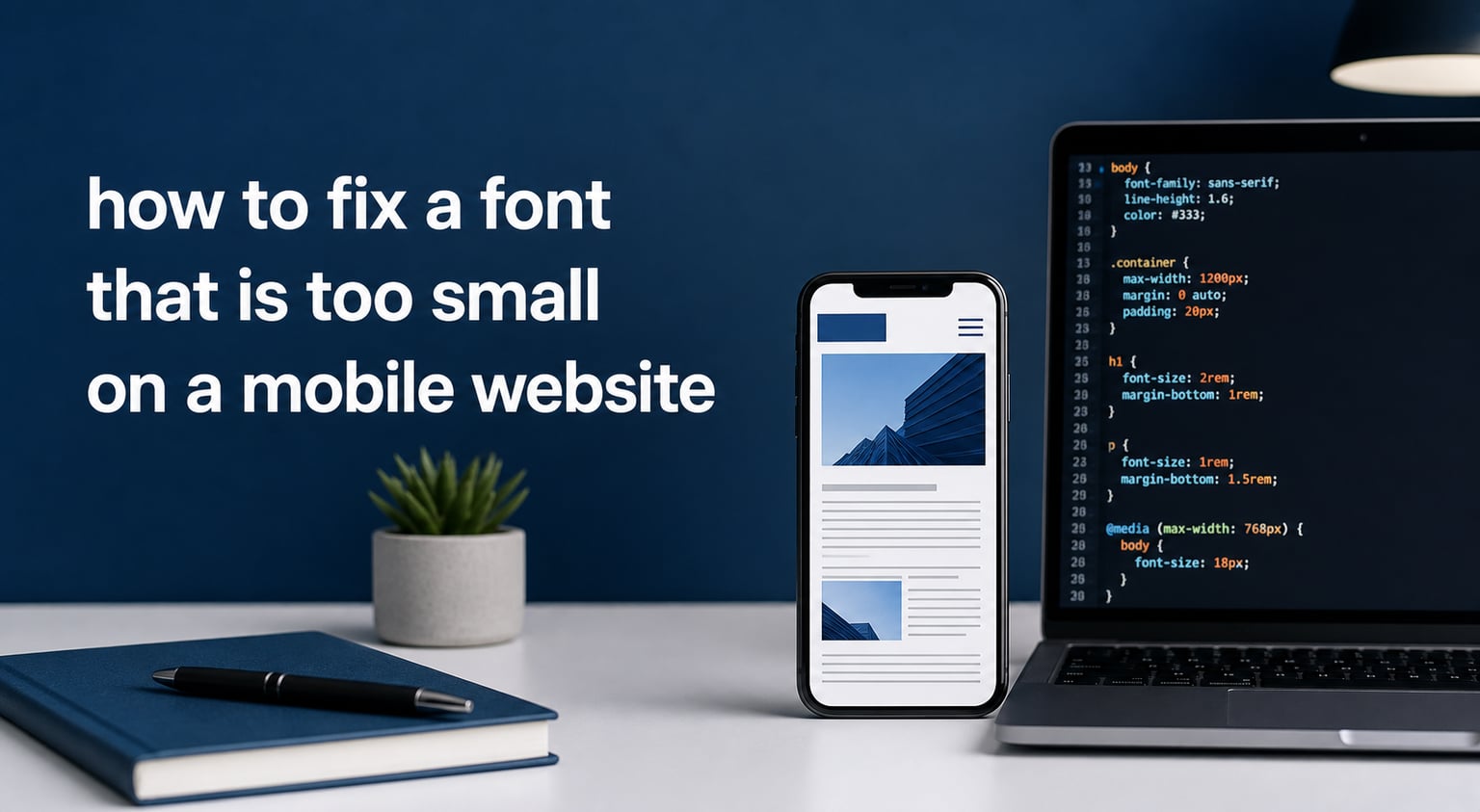
I spent the better part of an afternoon squinting at my own site on my phone before I figured out what was happening. The desktop layout looked great, but the mobile version was showing fonts so tiny that I had to pinch to zoom just to read a single sentence. If you are searching for how to fix a font that is too small on a mobile website, you are not alone. This is one of the most common frustrations I hear from site owners, and the fix is easier than most people think.
Mobile readability matters more than ever. Google now uses mobile-first indexing, which means it looks at the mobile version of your site to decide rankings. Tiny fonts push visitors away, hurt your bounce rate, and quietly damage your search visibility. In this guide, I will walk you through the exact steps I use to fix mobile font sizes, including the one line of code that solves most of the problem.
Table of Contents
What Causes Small Font on Mobile Websites
Small font on mobile websites usually comes down to three root causes. The first and most common is a missing or incorrect viewport meta tag. Without it, mobile browsers assume your site was designed for a 980-pixel-wide desktop screen and shrink everything to fit, which makes text nearly unreadable.
The second cause is desktop-first CSS. If your font-size values were written for a 1920px monitor without responsive adjustments, those same values will render far too small on a 375px phone screen. The third cause is outdated best practices. Many older tutorials still recommend 12px body text, which is below the recommended minimum for mobile readability.
Adding to the confusion, iOS Safari auto-zooms the screen when you tap an input field with a font-size below 16px. This creates the illusion that the rest of your page is tiny, even when only the input is the problem. The good news is that fixing all of this takes about ten minutes once you know where to look.
How to Fix a Font That Is Too Small on a Mobile Website
The fastest way to fix a font that is too small on a mobile website is to work through four fixes in order. Start with the viewport meta tag, then adjust your CSS font-size values, add responsive media queries, and finally use the text-size-adjust property to prevent unwanted browser scaling. Most sites see a complete fix after just the first two steps.
Step 1: Add the Viewport Meta Tag
The viewport meta tag is the single most important fix for mobile font issues. It tells the browser how to scale your page relative to the device width. Without this tag, browsers assume your site is 980px wide and shrink everything down, making fonts appear tiny.
Add this code inside your <head> section, placed above any other meta tags:
<meta name="viewport" content="width=device-width, initial-scale=1.0">
Here is what each part does. width=device-width tells the browser to match the screen width in CSS pixels. initial-scale=1.0 sets the initial zoom level to 100 percent. Together, these stop the browser from pretending your phone is a desktop monitor.
Common mistakes to avoid with the viewport meta tag include using user-scalable=no (which hurts accessibility), setting an explicit pixel width like width=600 (which breaks responsive design), or omitting the tag entirely. Check your HTML now and confirm the tag is present and correct. If you use WordPress, most modern themes include this by default, but custom themes often miss it.
Step 2: Set Minimum Font Sizes with CSS
Once the viewport tag is correct, the next step is to set a sensible minimum font size in your CSS. The widely accepted minimum for body text on mobile is 16px. Anything smaller forces users to zoom in, and on iOS, anything below 16px in form inputs triggers an unwanted auto-zoom behavior.
Here is a basic CSS pattern that works for most sites:
body { font-size: 16px; line-height: 1.5; }
For better accessibility, I recommend using rem units instead of pixels. rem units scale with the user’s browser settings, which helps visitors who have adjusted their default text size. One rem equals the root font size, which is typically 16px by default.
body { font-size: 1rem; line-height: 1.5; }
h1 { font-size: 2rem; }
h2 { font-size: 1.5rem; }
p { font-size: 1rem; }
Never use pixels for form input fields on mobile. Always set inputs, textareas, and select elements to at least 16px to prevent iOS Safari from auto-zooming the page when a user taps a field.
Step 3: Use Media Queries for Responsive Typography
Media queries let you adjust font sizes based on screen width. This is the cleanest way to make text larger on mobile without affecting the desktop layout. The most common breakpoint for mobile adjustments is 768px, which covers most phones and small tablets.
Here is a typical mobile-first media query setup:
/* Base styles for mobile */
body { font-size: 16px; }
h1 { font-size: 1.75rem; }
/* Tablet and up */
@media (min-width: 768px) {
  body { font-size: 18px; }
  h1 { font-size: 2.25rem; }
}
/* Desktop and up */
@media (min-width: 1024px) {
  body { font-size: 18px; }
  h1 { font-size: 2.5rem; }
}
Start with mobile styles first, then layer on larger sizes for tablets and desktops. This mobile-first approach matches how users experience your site and keeps your CSS easier to maintain. If you find yourself writing overrides for desktop, flip the approach and start small.
Step 4: Prevent Auto-Zoom with text-size-adjust
Some mobile browsers, particularly older versions of iOS Safari, will inflate text sizes automatically when they detect a page is being zoomed. This behavior can be controlled with the -webkit-text-size-adjust property. Setting it to 100 percent tells the browser to respect your CSS values exactly.
Add this to your CSS to prevent unwanted scaling:
html { -webkit-text-size-adjust: 100%; }
Use this property carefully. Setting it to 100 percent disables the user’s ability to scale text using their browser settings, which can affect accessibility. If accessibility is a priority for your audience, leave this property at its default value or use auto instead.
Recommended Font Sizes for Mobile Websites
Here are the font size guidelines I follow when optimizing mobile websites. These numbers come from extensive UX research and are backed by accessibility standards like WCAG.
Body text: 16px to 20px. Anything below 16px is too small for comfortable reading on mobile. For text-heavy articles, 18px provides a more relaxed reading experience.
Headings: H1 should be 24px to 32px, H2 around 20px to 24px, and H3 around 18px to 20px. Headings should always be visually distinct from body text.
Secondary text: Captions, labels, and helper text should be at least 14px. This is the absolute minimum for legibility. Anything smaller should be avoided.
Form inputs: 16px minimum, no exceptions. This prevents iOS Safari from auto-zooming when users tap a field.
Line height matters too. Aim for 1.4 to 1.6 times the font size for body text. Tight line height makes paragraphs feel cramped on mobile, especially when reading in bright sunlight.
Testing Your Mobile Font Sizes
After making changes, test on real devices before considering the job done. Chrome DevTools has a device mode that lets you preview your site on different screen sizes, but it does not perfectly replicate real browser behavior. The only way to know for sure is to open your site on an actual phone.
Check at least three things. First, confirm body text is readable without zooming. Second, tap each form input and make sure the page does not auto-zoom unexpectedly. Third, scroll through the entire page and check that headings, paragraphs, and small text all look balanced.
Test on both iOS Safari and Android Chrome. These two browsers handle font rendering slightly differently, and a fix that works on one may not look identical on the other. If you have access to friends or coworkers with different devices, ask them to test as well.
Frequently Asked Questions
How do I enlarge the font size in mobile?
Add a viewport meta tag to your HTML head with width=device-width and initial-scale=1.0. Then set your body font-size to at least 16px in CSS. For mobile-specific adjustments, use a media query like @media (max-width: 768px) { body { font-size: 18px; } } to make text larger only on small screens.
Why is my website font so small?
Your website font is small on mobile because the viewport meta tag is missing or incorrect. Without this tag, mobile browsers assume your site was designed for a 980px desktop screen and shrink the entire page to fit. Adding the viewport meta tag and setting body font-size to at least 16px fixes the issue in most cases.
What font size to use for a mobile website?
Use 16px to 20px for body text on a mobile website. Headings should be 24px to 32px for H1 and 20px to 24px for H2. Secondary text like captions and labels should be at least 14px. Form inputs must be at least 16px to prevent iOS Safari from auto-zooming when tapped.
How to fix font size on a certain website?
To fix font size on a website you visit, use your browser’s built-in zoom controls. In Chrome mobile, tap the three-dot menu and adjust the text scaling slider. For permanent fixes to your own site, add the viewport meta tag and update CSS font-size values to 16px minimum for body text.
Conclusion
Learning how to fix a font that is too small on a mobile website comes down to four key fixes. Add the viewport meta tag to tell browsers how to scale your page. Set body font-size to at least 16px and use rem units for better accessibility. Use media queries to make text larger on mobile without affecting desktop. Finally, use the text-size-adjust property cautiously to prevent unwanted browser scaling.
The 16px minimum is the rule I follow on every mobile site I work on. It satisfies accessibility guidelines, prevents iOS Safari auto-zoom, and provides a comfortable reading experience on small screens. Start there, then build up your responsive typography with media queries and you will have a mobile site that visitors actually want to read.
Take fifteen minutes today to audit your site. Check the viewport meta tag, confirm your body font-size is at least 16px, and test on your phone. These small changes often produce the biggest improvements in mobile readability and user engagement.