
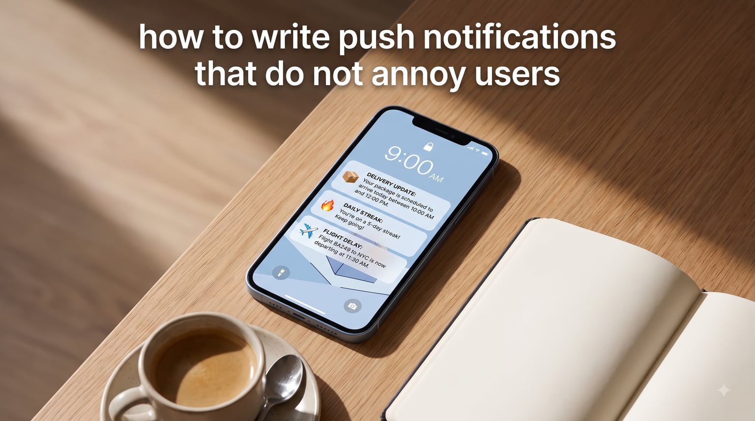
Practical guide on how to write push notifications that do not annoy users, drawn from real platform data, competitor patterns, and what I have seen actually move retention. Every app on your phone has the same problem: one push too many and you delete the app. According to multiple industry studies, 71% of users uninstall an app because of annoying notifications, so the stakes are real. This guide gives you the rules, the timing, the copy patterns, and the case studies I trust most, all in one place.
By the end, you will have a clear framework for permission requests, frequency, timing, personalization, and user control, plus a checklist you can apply to your next campaign.
Table of Contents
Why Push Notifications Annoy Users
Push notifications are messages that apps and websites send to a user’s device to re-engage them with timely information. They work through a permission-based system: the user opts in, then a push service like APNs for iOS, FCM for Android, or Web Push for browsers delivers the message. The whole mechanism is built on consent, which is exactly why overuse feels personal.
When users complain about push notifications, the complaints usually fall into a few patterns I have seen across Reddit threads, App Store reviews, and product feedback. Random notifications from sources users never subscribed to. Too many notifications from a single app like Reddit or Instagram. Settings that are buried so deep that disabling them feels like a puzzle. Notifications for content the user never asked about. Each one chips away at trust.
The risk is more than annoyance. Push notifications can directly damage retention and uninstall rates. One bad batch of opt-out friction, and a user decides your app is not worth the home screen space. Treating the channel as a privilege, not a megaphone, is the mindset shift that separates apps users keep from apps users delete.
How to Write Push Notifications That Do Not Annoy Users: The 3 Rules
Every notification that lands on a user’s lock screen should pass three tests before you send it. These are the rules I return to whenever I review a campaign.
- Timing: The message arrives when the user can act on it, not when it is convenient for you to send.
- Precise and actionable: The user knows exactly what the notification is about and what to do next in under five seconds.
- Personal: The content reflects the user’s behavior, location, or stated preferences, not a one-size-fits-all broadcast.
If a notification fails any one of those three tests, it is probably not worth sending. The rest of this guide breaks each rule into specific moves you can make this week.
Step 1: Ask for Permission the Right Way
You only get one shot at the native browser or OS permission prompt. If you waste it on page load, you do not get another. Here is how to ask without burning that one chance.
Never ask on first page load
The classic mistake is firing the permission dialog within the first two seconds of a session. The user does not know your site, what value it offers, or why they would want notifications from you. They tap block, and you lose them forever.
Instead, wait until the user has experienced a moment of value. A few patterns that work well: after the user finishes onboarding and reaches the home screen, after they save an item to a wishlist, after they hit a useful result like a price drop or a saved search. The common thread is that the user has just done something that proves they want to come back.
Use the double permission pattern
Most teams do not realize you can warm users up with an in-app prompt before the native dialog ever appears. Show a custom slide explaining what notifications you send, how often, and what the user gets out of opting in. If they tap yes on your custom prompt, follow up with the native prompt. If they tap no on the custom prompt, do not fire the native prompt at all.
This pattern, which Stephanie Walter popularized, raises opt-in rates by 30-50% in many A/B tests. The reason is simple: you are giving the user a no-pressure preview of the decision. Users who say yes to the in-app slide are nearly always saying yes to the native prompt. Users who say no on the slide save you from a guaranteed block.
Treat the ask as a transaction, not an interruption
Frame the value in plain language. We will let you know when your favorite team scores, not Get notified. Use second person, name the frequency if you can, and keep the button copy aligned with the benefit.
Step 2: Nail the Timing
Even a great notification can feel intrusive at 6:47am. Timing is the single biggest factor in whether a push gets a tap or a swipe to dismiss.
Respect time zones and quiet hours
Always store the user’s time zone at sign-up and update it when the location changes. A notification that fires at 9am in your office should fire at 9am in the user’s local time, not in your server’s time. Layer in quiet hours, typically 10pm to 7am local, and skip notifications during that window unless the message is transactional, like a flight delay or a security alert.
Match the use case to the moment
Some notifications are best sent immediately. Delivery updates, two-factor codes, and breaking news alerts earn their interruption. Others, like weekly digests and promotional nudges, perform better when batched into predictable windows. Decide which category each message type belongs to, and write a timing rule for it. Your future self will thank you.
Test your time-to-tap
Open your analytics and look at click-through rate by hour of day. You will almost always see a clear pattern, and it is rarely 8am on a Tuesday. Adjust your send windows toward your highest-converting hours and watch retention follow.
Step 3: Write Precise, Actionable Copy
The lock screen is the most expensive real estate on a phone. You have about 40 characters before the message gets truncated on most devices. Spend those characters on the user, not on your brand.
Front-load the value
Put the most useful word first. Your package from Amazon arrives at 4pm beats Amazon: package arriving soon in every test I have seen. The user should know what the notification is about within the first two words.
Use verbs and specific numbers
Vague teasers like You will not believe this or Something happened in your account burn trust fast. Specifics build trust. 3 new messages from Sarah, Score update: Lakers up by 7, Your flight is delayed by 45 minutes, all tell the user what they are getting into before they tap.
Avoid FOMO and emoji clutter
The temptation to write things like LAST CHANCE or use three exclamation marks is strong. Resist it. Notifications that rely on manufactured urgency are the ones users mute first. Keep the tone matter-of-fact, friendly, and short.
Localize the copy, not just the language
Translation is not localization. A notification in German about a flash sale needs to account for German shopping hours, currency formatting, and cultural norms around urgency. Tools like Lokalise or Phrase can help, but the real work is having a local reviewer look at the final message before you ship it.
Step 4: Personalize Without Being Creepy
Personalization is the difference between a notification users welcome and one users resent. The line between helpful and creepy is thinner than most teams realize.
Anchor personalization in behavior, not surveillance
Use signals the user has given you directly. Past purchases, saved searches, content they have read, items they have favorited. These are signals the user opted into. Avoid pulling in third-party data the user never shared with you, and never reference microphone, location, or browsing outside your app.
Segment before you send
The single highest-impact personalization tactic is segmentation. New users get onboarding nudges. Power users get power features. Lapsed users get re-engagement offers. Each segment gets its own copy and its own frequency cap. This alone can lift click-through rates by 20-40%.
Consider location-based notifications carefully
Location-aware push notifications can be powerful, like reminding a shopper about an item on their list when they walk into the store. They can also be intrusive. Only request location permission when the user has a clear reason to grant it, and always offer a manual alternative.
Step 5: Get the Frequency Right
Frequency is where most apps cross the line from helpful to annoying. There is no single universal number, but there are some reliable guidelines.
Cap by category, not by app
Most product teams I have worked with cap at 2-3 transactional pushes per week, 1-2 content pushes per week, and 1 promotional push per week as a starting point. That is roughly 4-6 notifications per week total, with quiet hours respected.
Watch the engagement curve
If your click-through rate drops week over week while your send volume holds steady, you are sending too often. If your opt-out rate spikes after a campaign, that campaign was too frequent or too low value. Build a dashboard that shows CTR and opt-out rate side by side, and review it every week.
Honor unsubscribes immediately
When a user toggles off a category or hits unsubscribe, propagate that change to your push service within minutes, not hours. Lag between opt-out and the next send is one of the fastest ways to push a user toward uninstall.
Step 6: Give Users Real Control
Users who can control their notifications stay longer. That sentence is the entire argument for building granular preferences.
Offer categories, not just an on/off switch
One global toggle forces users to choose between your app and their sanity. Categories like Breaking news, Order updates, Recommendations, and Weekly digest give users a way to keep the parts they want and silence the parts they do not.
Make settings easy to find
The single most common complaint I read on forums and app reviews is that notification settings are buried. Put the entry point in your profile, in your settings, and in the notification itself. Every push you send should include a deep link to its own preferences page.
Respect the OS-level kill switch
If a user disables notifications for your app at the OS level, do not keep sending in-app messages begging them to turn them back on. They made a clear decision. Honor it and earn the right to be re-enabled through good in-app experience, not pleading banners.
Platform Differences: iOS vs Android vs Web
The three big platforms handle push differently, and your copy should adapt. This is the gap most guides miss.
iOS: shorter, richer, notification summary aware
iOS users get notification summaries that bundle low-priority pushes. Mark anything that is not time-sensitive as low priority so it lands in the summary rather than interrupting the user. iOS also supports rich notifications with images, action buttons, and threaded replies, so use them for transactional messages where they reduce friction.
Android: channels and granular control
Android introduced notification channels years ago, and they map perfectly to the category strategy above. Create a channel for each category, and let users tune each one independently from system settings. Channel-level opt-outs are far less destructive than app-level opt-outs.
Web: Safari and Firefox friction
Safari requires push to be installed as a PWA before it can ask for permission. Firefox disables Web Push entirely on mobile. Chrome supports Web Push on both desktop and Android. If your audience includes a lot of Safari mobile users, plan a path that guides them to install your site as a PWA before you ever ask for permission.
Case Studies: Who Got It Right and Wrong
Theory is useful, but real examples are how you build conviction. Three case studies I keep coming back to.
Groupon: the cautionary tale
Groupon became infamous for sending 3-5 promotional notifications per day, many of them vague deals unrelated to the user’s location or interests. The result was predictable: opt-out rates climbed, app uninstalls spiked, and the channel burned out within months. The lesson is that frequency without relevance is just noise.
Pinterest: engagement at any cost
Pinterest pushed hard on engagement-based triggers, sending a notification whenever someone the user followed pinned something. The intent was good, but the volume was unsustainable. Users who did not follow many people still got a steady drip, and the channel felt like a firehose. Pinterest has since moved toward grouped digests that summarize activity rather than alerting on every pin.
Duolingo: motivation done right
Duolingo is the gold standard for push notifications done well. The app personalizes timing to each user’s study habits, sends a streak reminder at the moment a streak is most at risk, and uses friendly, specific copy. Notifications feel like a coach, not a marketer. The result is among the highest retention rates in edtech.
The Push Notification Checklist
Use this checklist before every campaign. If you can tick every box, ship it. If you cannot, fix the gap first.
- The user has opted in within the last 90 days and has not blocked at the OS level.
- The send time respects the user’s local time zone and quiet hours.
- The copy fits in 40 characters before truncation and front-loads the value.
- The content reflects a behavior, preference, or signal the user gave you.
- The frequency cap for this category has not been hit this week.
- The notification includes a deep link to its own preferences page.
- The unsubscribe path is honored within minutes of any opt-out.
Frequently Asked Questions
What are some good examples of push notifications?
Specific, behavior-driven messages work best. Examples include ‘Your package from Amazon arrives at 4pm’, ‘Sarah sent you 3 new messages’, ‘Lakers are up by 7 with 2 minutes left’, and ‘Your flight is delayed by 45 minutes’. Each one tells the user exactly what the notification is about in under five seconds.
How do I stop annoying notifications?
Go to your device settings, find Notifications, and turn off the app entirely or by category. Inside the app, look for a Settings or Preferences section, usually under your profile, and disable the notification categories you do not want. Most modern apps also include an Unsubscribe link at the bottom of every push notification that takes you directly to its settings.
What are some best practices for push notifications?
Ask for permission after the user has experienced value, not on first page load. Respect time zones and quiet hours. Keep copy under 40 characters and front-load the value. Personalize based on behavior the user opted into. Cap frequency at 4-6 notifications per week. Offer category-level opt-outs, not just a global kill switch. Include a deep link to preferences in every push.
Why are push notifications risky?
Push notifications are risky because they interrupt the user and cannot be undone once delivered. According to industry data, 71% of users who uninstall an app cite annoying notifications as the reason. Overuse, poor timing, vague copy, and hidden settings all push users toward uninstall. Treat the channel as a privilege, not a megaphone.
How many push notifications are too many?
A practical starting cap is 4-6 notifications per week total: 2-3 transactional, 1-2 content, and 1 promotional. If your click-through rate drops week over week or your opt-out rate spikes, you are sending too often. Always honor opt-outs within minutes and never send after a global OS-level disable.
How do I ask for push notification permission without annoying users?
Use the double permission pattern. Show an in-app custom slide explaining what notifications you will send and why they are valuable. Only fire the native OS prompt if the user taps yes on your custom slide. Time the ask for after a moment of value, like completing onboarding or saving an item, never on first page load.
Conclusion
How to write push notifications that do not annoy users comes down to treating the channel as a privilege, not a megaphone. Ask for permission after value, never on page load. Respect time zones and quiet hours. Keep copy under 40 characters and front-load the value. Personalize from behavior the user opted into. Cap volume at 4-6 per week. Offer category-level controls and honor opt-outs in minutes. Adapt to iOS, Android, and Web differences. Learn from Groupon and Pinterest what not to do, and from Duolingo what good looks like.
The push channel is one of the highest-leverage retention tools your app has, and one of the fastest ways to lose a user when misused. Run your next campaign through the checklist above, pick one rule to tighten this week, and watch the uninstall curve bend the other way.