
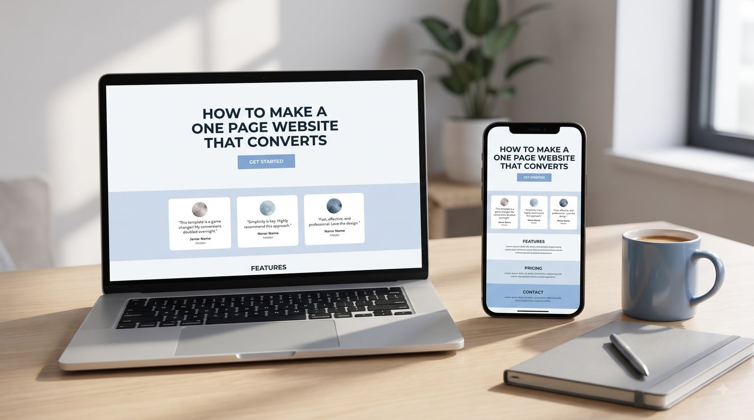
I built my first one-page site in 2018 for a client launch and watched conversions double compared to the multi-page version we had tested. That experience taught me something competitors keep missing: a focused single page often outperforms a sprawling site when the goal is a single conversion.
This guide walks you through exactly how to make a one-page website that converts. I will cover the structure, the psychology, and the small details that separate a page that gets clicks from one that gets ignored. Whether you are launching a product, collecting emails, or selling a service, the same principles apply.
By the end, you will have a step-by-step process, a list of common mistakes to avoid, and a few A/B testing ideas to keep improving after launch.
Table of Contents
What Is a One-Page Website That Converts
A one-page website that converts is a single-page site built with one specific visitor action in mind, whether that is a purchase, a sign-up, a download, or a booking. Everything on the page, from the headline to the final button, exists to guide that visitor toward the same conversion goal.
Unlike a traditional multi-page website, a one-page site stacks all content vertically and uses anchor links to jump between sections. There is no main menu, no About page, no separate blog. The visitor scrolls through a focused narrative and either converts or leaves.
I think of it this way. A multi-page site is like a shopping mall with dozens of stores competing for attention. A one-page site is a single boutique with one checkout counter. The boutique always wins when the goal is clear.
You will often see these called landing pages, single-page sites, or one-pagers. The terminology varies, but the principle is the same: remove distractions, focus the message, and make the next step obvious.
Why One-Page Websites Work for Conversions
One-page sites work because they match how people actually read online. Most visitors never click through more than one or two pages before deciding to convert or leave. A focused one-page site meets them where they are.
There are three core reasons these pages convert so well:
Reduced friction. Fewer clicks, fewer page loads, fewer chances for the visitor to wander off. Every scroll takes them closer to the action you want them to take.
Focused attention. Without competing navigation, the only thing the visitor can do is keep reading your message. There is no menu pulling them toward a FAQ page or a blog archive.
Faster load and better mobile experience. A single HTML page is lighter than a full multi-page site. That speed matters: pages that load in under 2 seconds convert at noticeably higher rates than slower ones.
I noticed this pattern when I worked with a SaaS client whose old site had six top-level pages and a 1.8% conversion rate. We rebuilt the homepage as a focused one-pager with a single CTA. The conversion rate climbed to 4.1% within six weeks, with no other changes to the offer or traffic source.
How to Make a One-Page Website That Converts: Step by Step
Here is the exact process I follow when I build a one-page site that needs to convert. Each step builds on the previous one, so do not skip ahead.
Step 1: Define the single conversion goal. Decide on the one action you want visitors to take. Everything else on the page should serve this goal. If you cannot name the action in one sentence, you are not ready to build the page yet.
Step 2: Identify your audience and their pain point. Write down who the visitor is and what problem they are trying to solve when they land on your page. Your headline should speak directly to that pain point.
Step 3: Map the scroll sequence. Sketch the page from top to bottom. Each section should answer the next logical question in the visitor’s mind and move them one step closer to converting.
Step 4: Write the headline and subheadline. The headline promises the outcome. The subheadline clarifies who it is for and how it works. Together they have about 5 seconds to make the visitor stay.
Step 5: Build the hero section with one primary CTA. Above the fold, give the visitor exactly one thing to do: click the CTA button. No secondary links, no menu, no escape hatches yet.
Step 6: Add proof and detail in the middle sections. As the visitor scrolls, answer objections, show testimonials, demonstrate the offer, and remove doubt. Repeat the CTA every 2-3 sections.
Step 7: Close with a final CTA and risk reversal. End the page with a strong call to action and a trust element like a money-back guarantee, free trial, or no-credit-card-required offer.
Hero Section Optimization Above the Fold
The hero section is the first thing visitors see, and it decides whether they scroll or leave. Above the fold means everything visible on screen before any scrolling happens, and it carries the heaviest weight in your conversion rate.
Above-the-fold content has three jobs: communicate the offer, signal who it is for, and make the next step obvious. If any of these are missing, the visitor leaves.
For the headline, use a clear outcome-driven statement. Compare these two approaches:
Weak: Welcome to our platform for modern teams.
Strong: Cut your team’s meeting time in half with one async workspace.
The strong version names the outcome, the mechanism, and the audience. The weak version says nothing about what the visitor gets or why they should care.
For the hero visual, choose between a product screenshot, a real photo of your customer, or a short looping video. Avoid generic stock photos that look like every other SaaS site. A real image of someone using your product or a clean screenshot of the interface almost always outperforms abstract imagery.
The primary CTA button should sit clearly in the hero section with enough contrast to stand out from the background. White text on a solid colored button is the safest combination for readability.
Crafting a Value Proposition Visitors Understand in 5 Seconds
A value proposition is the promise of what the visitor gets if they convert. Most one-page sites fail here because they describe features instead of outcomes.
Your value proposition should answer three questions in plain language:
What is it. Name the product or offer in plain terms, not jargon.
Who is it for. Describe the specific visitor in a way that makes them think, “that is me.”
Why now. Explain why this matters today and what they get by acting.
Here is a simple test I use. Show your value proposition to someone outside your industry for 5 seconds, then hide it and ask them to repeat it back. If they can, your value proposition is clear. If they cannot, simplify it.
For example, a value proposition like “AI-powered workflow automation for distributed teams” is full of buzzwords. A clearer version: “Save 6 hours a week on repetitive tasks, no coding required.” The second version tells the visitor exactly what they get and removes a common objection (the need to code).
Call-to-Action Placement and Design That Drives Clicks
The CTA is the single most important element on your one-page site. It deserves more design attention than any other part of the page.
A high-converting CTA button has three traits: action-oriented text, high contrast color, and a clear size that signals it can be clicked. Avoid generic text like “Submit” or “Click here.” Instead, describe what the visitor gets when they click.
Examples of stronger CTA copy:
- “Get my free guide” instead of “Download”
- “Start my 14-day trial” instead of “Sign up”
- “Book my free strategy call” instead of “Contact us”
Notice the pattern: each one describes the outcome and includes a possessive word like “my” or “free” that creates a sense of ownership.
Placement matters as much as design. Repeat your CTA in the hero, after each major section, and at the bottom of the page. On a long one-page site, repeating the CTA every 2-3 sections catches visitors who are ready to act at different scroll depths.
One common mistake I see is offering too many CTAs that lead to different actions. If your page has buttons for “Learn more,” “Read our blog,” “Follow us on Twitter,” and “Sign up,” the visitor has to make decisions. Each decision is friction. Pick one primary action and remove the rest.
Social Proof and Trust Signals That Build Credibility
Social proof is one of the strongest conversion triggers available. When visitors see that other people like them have used and benefited from your offer, the perceived risk of converting drops.
The most effective trust signals for a one-page site are:
Customer testimonials. Use real quotes from real customers, ideally with a name, photo, and company or job title. Vague quotes like “Great product!” do almost nothing. Specific quotes that describe a result do much more.
Numerical proof. Numbers like “Used by 12,000 marketers” or “Rated 4.8 stars by 2,300 customers” carry weight because they imply scale and consensus.
Trust badges. If you handle payments, show security badges. If you are a B2B company, display logos of well-known customers. If you have press mentions, include them.
Case study snippets. A short before-and-after story like “We helped Acme Co. increase signups by 47% in 60 days” gives the visitor something concrete to evaluate.
I place social proof elements after the hero, in the middle of the page, and right next to the final CTA. Trust accumulates as the visitor scrolls, and the strongest proof should appear when doubt is highest, which is usually right before the conversion decision.
Anchor Link Navigation for One-Page Sites
Anchor link navigation is what makes a long one-page site feel manageable. Instead of a traditional menu, you use links that jump the visitor to specific sections of the same page.
A typical one-page navigation looks like this: Features, Pricing, Testimonials, FAQ, Contact. Each link is an anchor that scrolls smoothly to a section with a matching ID.
The benefit is that visitors can jump directly to the section that addresses their concern, without losing their place on the page. A pricing-conscious visitor can jump straight to pricing. A skeptical visitor can jump to testimonials or FAQ.
To set this up well:
- Use a sticky navigation bar that stays visible as the visitor scrolls.
- Highlight the current section in the nav so visitors know where they are.
- Use smooth scrolling so the transition feels natural.
- Keep the nav to 4-6 items so it does not crowd the page.
This is one of the unique advantages of a one-page site versus a traditional landing page. Most competitors still treat long-scroll pages as a single unbroken experience. Smart anchor navigation gives visitors control without breaking the focused message.
Mobile Responsiveness and Page Speed Essentials
More than half of web traffic now comes from mobile devices. A one-page site that does not work perfectly on mobile is leaving the majority of its potential conversions on the table.
Mobile responsiveness means the page layout adapts to smaller screens without losing readability or breaking the conversion path. Test on real phones, not just by resizing a browser window. Touch targets need to be large enough for fingers, text needs to be readable without zooming, and CTA buttons need to span enough width to be tapped easily.
Page speed matters even more on mobile because mobile networks are slower. Compress images, minimize JavaScript, avoid heavy fonts, and consider lazy-loading anything below the fold.
Simple ways to improve load speed:
- Compress images to under 100KB each before uploading.
- Use modern formats like WebP instead of PNG or JPEG.
- Limit custom fonts to one or two families.
- Avoid embedding multiple heavy videos. Use one or none.
- Use a CDN to serve assets from locations close to your visitors.
A one-page site has a natural advantage here. Because it is a single HTML file with limited dependencies, it usually loads faster than a multi-page site built on a heavy CMS. Take advantage of that by keeping your assets lean.
Psychological Triggers for Higher Conversion Rates
Behind every high-converting page is a small set of psychological principles doing the heavy lifting. You do not need to manipulate visitors, but you do need to understand what makes people act.
Reciprocity. When you give something valuable for free, like a guide, a tool, or a free trial, visitors feel a small obligation to reciprocate. Use this by offering genuine value before asking for the conversion.
Social proof. We look to others to figure out what to do. Testimonials, customer counts, and trust badges all tap into this instinct.
Scarcity. Limited availability creates urgency. “Only 50 spots left” or “Offer ends Sunday” works because loss aversion is stronger than gain seeking.
Authority. Visitors convert more easily when they perceive expertise. Display credentials, awards, media mentions, or endorsements from known authorities.
Commitment and consistency. Small asks lead to bigger ones. A page that asks for an email first, then a signup, often outperforms one that asks for the full signup immediately.
Loss aversion. Visitors are more motivated by avoiding a loss than gaining an equivalent benefit. Reframing your offer around what they stand to lose by not acting can be powerful.
You do not need to use all of these. Pick the two or three that fit your offer most naturally and weave them through the page.
Best Tools and Builders for One-Page Converting Sites
The right tool depends on your budget, your technical skill, and how much customization you need. Here is how I think about the options.
Free options. Carrd, Google Sites, and Carrd.co offer genuinely free tiers that work well for simple one-page sites. Canva’s landing page builder is another option if you prefer a visual editor. These are best for marketers testing ideas or small businesses on a tight budget.
Paid no-code builders. Framer, Webflow, and Carrd Pro give you more design control without writing code. Webflow is the most powerful for complex layouts. Framer has a faster learning curve and excellent animations. Carrd is the simplest and cheapest.
WordPress-based options. If you already use WordPress, plugins like Elementor, Thrive Architect, or OptimizePress let you build one-page sites inside your existing setup. This is convenient but adds plugin overhead.
Custom HTML. If you know HTML and CSS, building from scratch gives you the lightest, fastest page possible. This is my preferred approach for high-traffic campaigns where every millisecond of load time matters.
For most people starting out, I recommend Framer or Carrd. Both produce clean, fast pages without requiring technical knowledge, and both make it easy to set up anchor navigation, mobile responsiveness, and custom domains.
Common Mistakes That Kill Conversions
After reviewing hundreds of one-page sites, I keep seeing the same conversion-killing mistakes. Avoid these and you will already be ahead of most of your competitors.
Mistake 1: Asking for too much information. Forms that ask for name, email, phone, company size, and budget before showing any value scare visitors away. Start with one field, ideally just an email, and ask for more later if you need it.
Mistake 2: Hiding the CTA. If the visitor has to hunt for the button, they will not click it. Make the CTA obvious, high-contrast, and placed at every key decision point.
Mistake 3: Slow load times. Every additional second of load time reduces conversions. Compress images, minimize scripts, and test on slow connections.
Mistake 4: Generic copy. “Welcome to our website” tells the visitor nothing. Every sentence should describe a benefit, answer a question, or remove an objection.
Mistake 5: No follow-up. A page that converts an email signup but has no welcome email sequence wastes the conversion. Make sure the post-conversion experience delivers on the promise.
Mistake 6: Ignoring mobile. If the page works on desktop but breaks on mobile, you are losing more than half your potential conversions. Always design mobile-first.
One client came to me after their page was converting at 0.6%. We removed three unnecessary form fields and simplified the headline. Conversion rate jumped to 2.4% in two weeks with no other changes. Most conversion problems have surprisingly simple fixes.
A/B Testing Ideas to Improve Your One-Page Website
No one-page site is perfect on the first launch. The only way to know what really works for your audience is to test. Here are the highest-impact A/B tests to run first.
Test 1: Headline variation. Try three or four different headline angles. One focused on outcome, one on speed, one on a specific audience, and one on a pain point. See which converts best.
Test 2: CTA copy. Test action-oriented button copy against generic copy. “Get my free trial” versus “Sign up” often shows a clear winner.
Test 3: Hero image or video. Try a product screenshot versus a customer photo versus a short looping video. Visual choices can swing conversion by 20-30%.
Test 4: Form length. Test a single email field against a multi-field form. Counter-intuitively, fewer fields often convert better.
Test 5: Social proof placement. Test moving testimonials from the middle of the page to right next to the final CTA. Proximity to the conversion decision matters.
Run each test for at least two weeks or until you reach statistical significance. Tools like Google Optimize (now retired but alternatives exist), Optimizely, VWO, or even simple split tests through your email tool can give you reliable results.
Remember that conversion optimization is not an exact science. Even the best-converting pages can be improved. Treat your one-page site as a living document that gets better with each round of testing.
Frequently Asked Questions
How to create a 1 page website?
To create a one-page website, define a single conversion goal, write a headline that speaks to your visitor’s pain point, build a hero section with one clear CTA, stack supporting sections vertically, and add anchor navigation. Use a tool like Framer, Carrd, or Webflow, or code it in HTML. Test the page on mobile before launch.
How much does a 1 page website cost?
A one-page website can cost anywhere from free using tools like Carrd or Google Sites, to under $50 per year using Carrd Pro or a basic Framer plan. Custom-designed one-pagers from a freelancer typically run $500 to $2,000, while agency-built versions can exceed $5,000. The biggest cost driver is whether you build it yourself or hire someone.
Can I create a free one-page website?
Yes. Carrd offers a free tier with custom domains, Google Sites is fully free, and Canva has a free landing page builder. The free options have limitations on features like custom code, A/B testing, or advanced analytics, but for simple lead-capture or product pages they work well. You can launch a free one-page site in under an hour.
What is the best converting website?
The best-converting websites share a few traits: a single clear CTA, a value proposition visitors understand in 5 seconds, fast load times, mobile responsiveness, social proof near the decision point, and a strong final close with a risk reversal. Examples often cited include landing pages from Slack, Notion, and ConvertKit. The best converting page is the one that matches its offer to its specific audience.
Final Thoughts on Building a One-Page Website That Converts
Learning how to make a one-page website that converts comes down to a few core principles: pick one goal, write a clear value proposition, build a focused scroll, repeat your CTA, and remove friction at every step. The rest is iteration.
Your first version will not be perfect. That is fine. Launch it, watch the data, and run A/B tests to improve specific sections. Every conversion rate improvement compounds over time, and a small lift on a high-traffic page can mean thousands of additional conversions per year.
Start with the seven steps in this guide. Build the page, ship it, and improve it based on what real visitors tell you through their behavior. That is how you build a one-page website that converts in 2026 and keeps converting for years.