
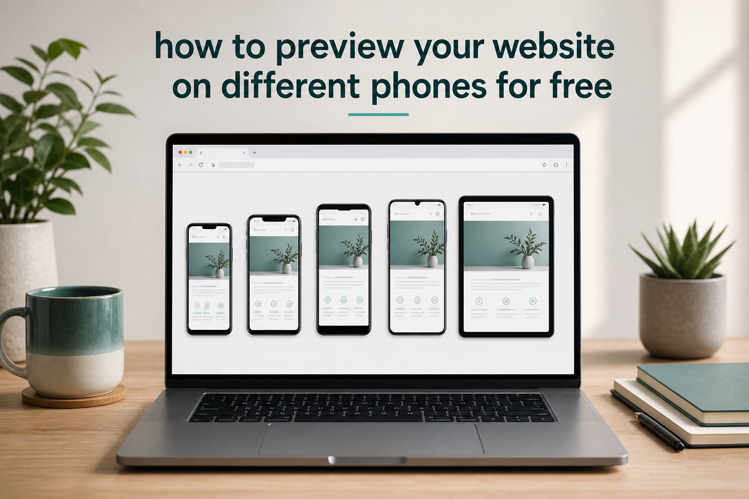
Learning how to preview your website on different phones for free is the single fastest way to catch layout problems before your visitors do. I learned this the hard way back when a client’s homepage looked perfect on my laptop but broke into a sideways-scrolling mess on an iPhone. That one missed check cost a weekend of emergency fixes.
Here is the good news. You do not need expensive software, a device lab, or even a single physical phone to test your site properly. In this guide, I will walk you through the exact free tools and step-by-step workflows we use to preview websites on iPhones, Android phones, and tablets before every launch.
You will learn what responsive testing actually means, which free tools are worth your time in 2026, how to test iPhone and Android separately, and the mistakes that trip up most beginners.
Table of Contents
What Is Responsive Website Testing?
Responsive website testing is the process of checking how your website looks and works across different screen sizes, from small phones to large desktop monitors. It answers one simple question: does my site adapt cleanly no matter what device someone is using?
Every responsive site is built on a few technical pieces that control this adaptation. You do not need to memorize them, but knowing the vocabulary helps you understand what the testing tools are actually showing you.
The four terms you will see everywhere
Viewport meta tag. A small line of HTML that tells mobile browsers to display your page at the correct width. Without it, phones render your site as a zoomed-out desktop page. If your site looks tiny and unreadable on a phone, this tag is usually the culprit.
CSS media queries. Rules in your stylesheet that apply different styles at different screen widths. For example, “when the screen is under 768 pixels wide, stack the columns instead of showing them side by side.”
Breakpoints. The specific widths where your design changes, commonly 480, 768, 1024, and 1440 pixels. Testing at and around each breakpoint is where you find broken layouts.
Device pixel ratio. The difference between CSS pixels and the physical pixels on a screen. A retina iPhone might report a width of 390 CSS pixels while packing three times that many physical pixels. This is why images that look sharp on your laptop can look blurry on a modern phone.
Why Responsive Testing Matters
Over 60% of web traffic now comes from mobile devices, and Google uses mobile-first indexing, meaning it primarily looks at the mobile version of your site when deciding rankings. If your mobile experience is broken, your SEO suffers right along with your visitors.
Device fragmentation makes this worse every year. There are thousands of distinct phone models in use, each with a different screen size, browser, and rendering quirks. You cannot buy them all, and you do not have to. You just need to test across a representative spread of screen sizes, which the free tools below handle well.
There is also a performance angle that most beginners miss. Emulated previews show you layout, but they cannot capture real device performance issues like slow touch response or janky scrolling on an older phone. Forum discussions among developers keep coming back to this point: emulation for layout, real devices for final checks.
How to Preview Your Website on Different Phones for Free
The fastest method takes under five minutes and requires nothing but a browser. Follow these steps and you will see your site the way phone users see it.
Step 1. Publish your site or use a preview link. Most tools need a live URL. If your site is not live yet, platforms like WordPress, Squarespace, and Wix all offer preview URLs you can paste in.
Step 2. Open a free responsive checker such as Responsive Test Tool or Mobile Viewer and paste your URL into the search box.
Step 3. Pick a phone preset. Start with a small phone like the iPhone SE, then a standard size like the iPhone 15 or Pixel 8, then a tablet like the iPad Mini.
Step 4. Check the critical zones: the header and navigation menu, hero text and buttons, image sizing, form fields, and the footer. Look for sideways scrolling, overlapping text, and buttons too small to tap comfortably.
Step 5. Rotate to landscape orientation and check again. Landscape breaks layouts that look fine in portrait, especially headers and video embeds.
Step 6. Repeat with a second tool. Every emulator renders slightly differently, and a second opinion catches quirks the first one misses.
7 Best Free Tools to Test Your Website on Mobile Devices
These are the tools that consistently came up in our testing and in developer forums this year. All of them are free to start with, and none require a credit card for basic checks.
1. Responsive Test Tool
This is the tool I reach for first for a quick check. Paste your URL, and it instantly renders your site across mobile, tablet, desktop, and TV screen sizes with no signup required. The custom viewport option lets you type in any exact pixel width, which is perfect for testing your breakpoints directly. It also captures screenshots you can share with clients or your team.
Best for: instant, no-friction checks across many screen sizes at once.
2. Chrome DevTools Device Mode
Built into Chrome on every desktop, this is the most widely used free option among developers. Open your site, press F12, then click the small phone-and-tablet icon in the top left of the panel. A dropdown lets you pick from dozens of device presets, and you can rotate, set a custom width, and even throttle your connection speed to simulate slow mobile networks.
The limitation developers keep flagging in forums is that DevTools does not perfectly match mobile Safari. It renders with Chrome’s engine, so it is excellent for layout but not the final word on iPhone behavior.
Best for: developers who need fast iteration plus network throttling.
3. BrowserStack Responsive Checker
BrowserStack’s free responsive checker lets you test your URL across a wide range of real device and browser combinations from your browser window. The free tier covers the common checkers most sites need, with paid plans unlocking their full cloud of over 3000 real devices. It is one of the closest free experiences to real device testing you can get without hardware.
Best for: cross-browser checking when you suspect Safari-specific issues.
4. Mobile Viewer
Mobile Viewer is a dedicated free mobile view website checker that previews any URL on iPhone, iPad, Android, and desktop frames. There is no signup, and it highlights mobile-friendliness problems it detects, which makes it a good choice if you want a verdict rather than just a preview. The side-by-side view lets you compare phone and desktop rendering at the same time.
Best for: non-technical users who want a pass-or-fail style check.
5. Responsively App
This open-source desktop app is the one forum users praise most enthusiastically. It shows multiple devices simultaneously with synchronized scrolling, so as you scroll one preview, they all scroll together. If you are iterating on a design and want to watch every breakpoint react in real time, nothing free comes close. Since it is open source, it has earned strong trust in the developer community.
Best for: designers and developers actively building, not just checking once.
6. WebsitePlanet Responsive Checker
A straightforward browser-based checker from hosting company WebsitePlanet. Enter your URL and cycle through common phone and tablet presets. It is a solid backup option when you want a second rendering engine to confirm what you saw in another tool, and the interface is friendly for complete beginners.
Best for: a quick second opinion from a different renderer.
7. SE Ranking Mobile-Friendly Test
This one overlaps with SEO rather than pure layout. It checks whether your site meets mobile-friendliness standards and reports issues that could hurt how you perform in mobile search results. Use it alongside a visual tool: the visual tool shows you what is broken, and this tells you whether it is hurting your rankings.
Best for: confirming your fixes satisfy search engine requirements.
How to Preview a Website on iPhone vs Android
iPhone and Android behave differently enough that I recommend testing them as separate passes rather than one generic “mobile” check.
Testing iPhone rendering
Step 1. Start with Chrome DevTools and select an iPhone preset to catch obvious layout breaks.
Step 2. Because mobile Safari is the browser most likely to differ from Chrome, run your URL through BrowserStack’s checker with a Safari-on-iOS combination for a closer approximation.
Step 3. If you have any Apple device handy, open the site in actual Safari. On a Mac, the responsive design mode in Safari (found under the Develop menu) includes built-in iPhone and iPad resolution options, a feature Mac users in forums specifically appreciate.
Step 4. Pay attention to Safari-specific quirks: sticky headers, input field zoom when font sizes are under 16 pixels, and smooth-scroll behavior.
Testing Android rendering
Step 1. Chrome DevTools is naturally accurate for Android since Chrome dominates Android browsing. Run through a small phone preset and a large one like the Pixel 8 Pro.
Step 2. Check Samsung Internet if your audience skews toward Samsung devices, which ship it as the default browser. BrowserStack can cover this combination.
Step 3. Test both portrait and landscape, since Android users rotate more often on larger phones and foldables.
Testing a local site that is not live yet
Beginners frequently find local server testing intimidating, but there is an easy path. WordPress, Squarespace, and Wix all generate preview links you can paste directly into any of the browser-based tools above. If you are developing on your own machine, tools like Locunnel or ngrok create a temporary public URL for your local site, and that URL works in every tool in this guide. No complicated server configuration required.
Common Mistakes to Avoid When Testing Responsive Design
Testing only in Chrome DevTools. It is the most popular tool and the source of the most false confidence. Mobile Safari renders differently, and issues like broken sticky headers often appear only there.
Skipping landscape orientation. Portrait-only testing misses broken headers, cut-off hero images, and unusable video players that appear the moment someone rotates their phone.
Only testing the newest phones. A meaningful share of your traffic likely uses phones that are three to five years old with smaller screens and less processing power. Include at least one small-screen preset like the iPhone SE in every test pass.
Checking the homepage and stopping. Your contact form, checkout page, and longest blog post are usually where layouts actually break. Test your most complex pages, not just your best-looking one.
Trusting emulation for performance. Emulators show layout accurately but cannot reproduce real device performance issues like laggy scrolling on older hardware. Before launch, open your site on at least one real phone you or a friend owns.
How Mobile Testing Affects SEO
Google uses mobile-first indexing, which means it evaluates primarily the mobile version of your site when ranking pages. A site that renders well on phones is effectively a prerequisite for ranking at all in 2026.
Mobile experience also feeds Core Web Vitals, particularly Largest Contentful Paint, which measures how fast your main content appears. Overloaded mobile layouts with oversized images drag this metric down directly. Add the indirect effect of mobile visitors bouncing from broken pages, and responsive testing becomes one of the cheapest SEO improvements available to you.
Frequently Asked Questions
How can I test my website on different devices?
Use a free responsive testing tool like Responsive Test Tool, Chrome DevTools device mode, or BrowserStack’s responsive checker. Paste your URL, select device presets covering small phones, standard phones, and tablets, then check navigation, text, images, and forms at each size.
How can I test my website for free?
Open Chrome DevTools with F12, click the device icon, and pick phone presets. For multi-device views, use free browser tools like Responsive Test Tool or Mobile Viewer, or the open-source Responsively App. All are free and none require payment for basic testing.
What is a free website that can test my phone?
Responsive Test Tool, Mobile Viewer, and WebsitePlanet’s responsive checker are all free websites that preview your URL on phone screens. BrowserStack’s free responsive checker and SE Ranking’s mobile-friendly test are also solid free options.
How to test mobile apps on multiple devices?
For mobile apps rather than websites, use free emulators like Android Studio’s emulator for Android and Xcode Simulator for iOS, or free tiers of device clouds like BrowserStack App Live. Test on the smallest and largest screen sizes your users have plus one older device.
Do browser emulators match real phones exactly?
No. Emulators accurately show layout and breakpoints but use your desktop browser’s rendering engine, so mobile Safari quirks and real device performance issues like laggy scrolling can differ. Use emulation for layout checks and at least one real device for final confirmation before launch.
Conclusion
Knowing how to preview your website on different phones for free comes down to a simple routine: run your URL through a responsive checker, test small phones, standard phones, and tablets, check landscape mode, and confirm Safari rendering separately from Chrome.
Start today with the five-minute workflow above using Responsive Test Tool or Chrome DevTools, then add Responsively App to your toolkit if you build sites regularly. Your mobile visitors, and your rankings, will notice the difference.